Exclusive Bike Services
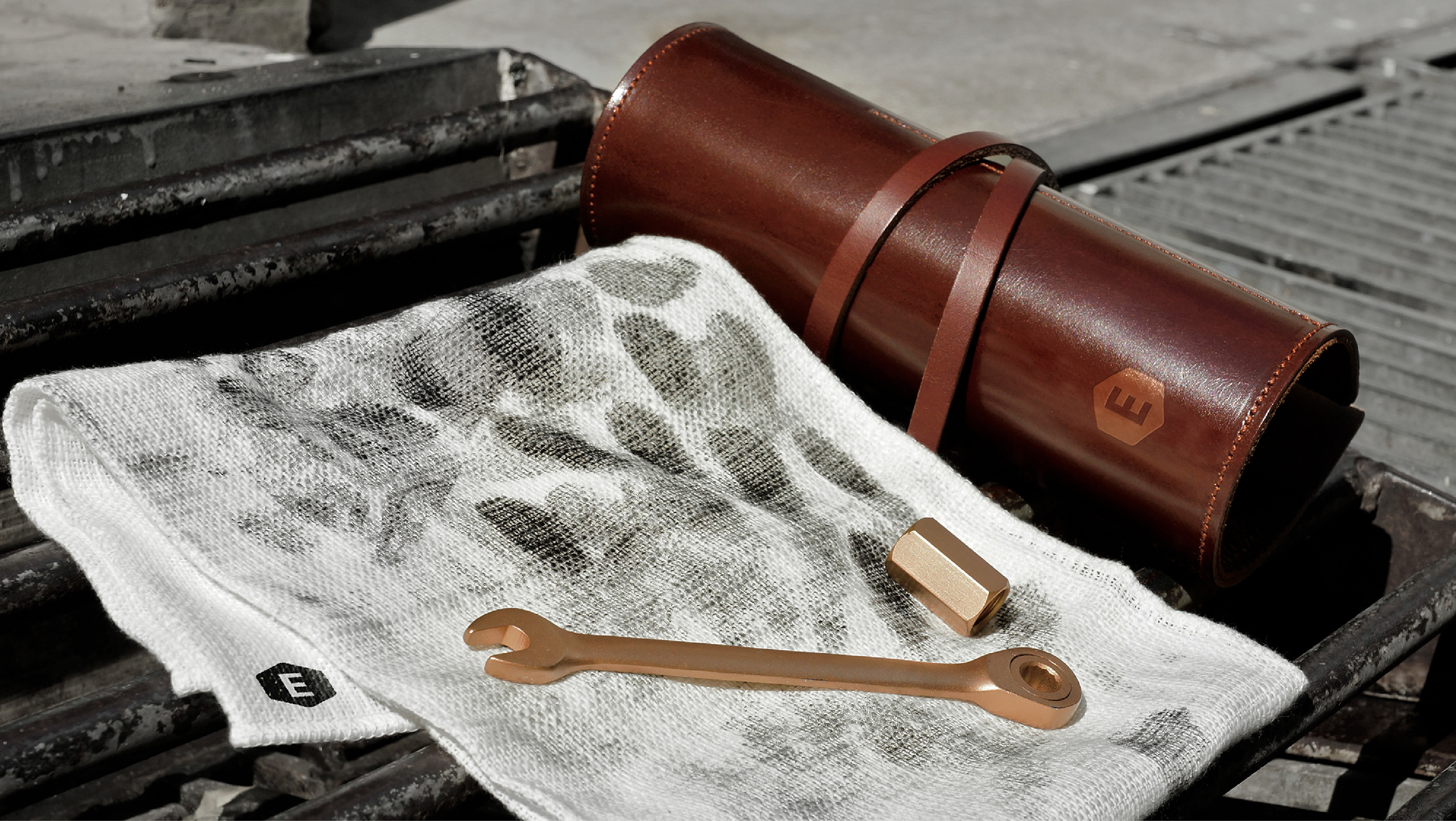
“Brand identity for a premium local bike service renowned for exceptional craftsmanship and precision.”

Precision in Motion
The brand identity embodies exclusivity, craftsmanship, and customisation. The logo features a sleek “E” within a hexagon, inspired by the shape of an Allen key, symbolising precision and mechanical artistry. A refined name card integrates metallic embossing and intricate linework, echoing the DNA of handcrafted bikes. A sophisticated colour palette—deep graphite, brushed steel, and subtle gold—reinforces pride, artistry, and bespoke excellence.
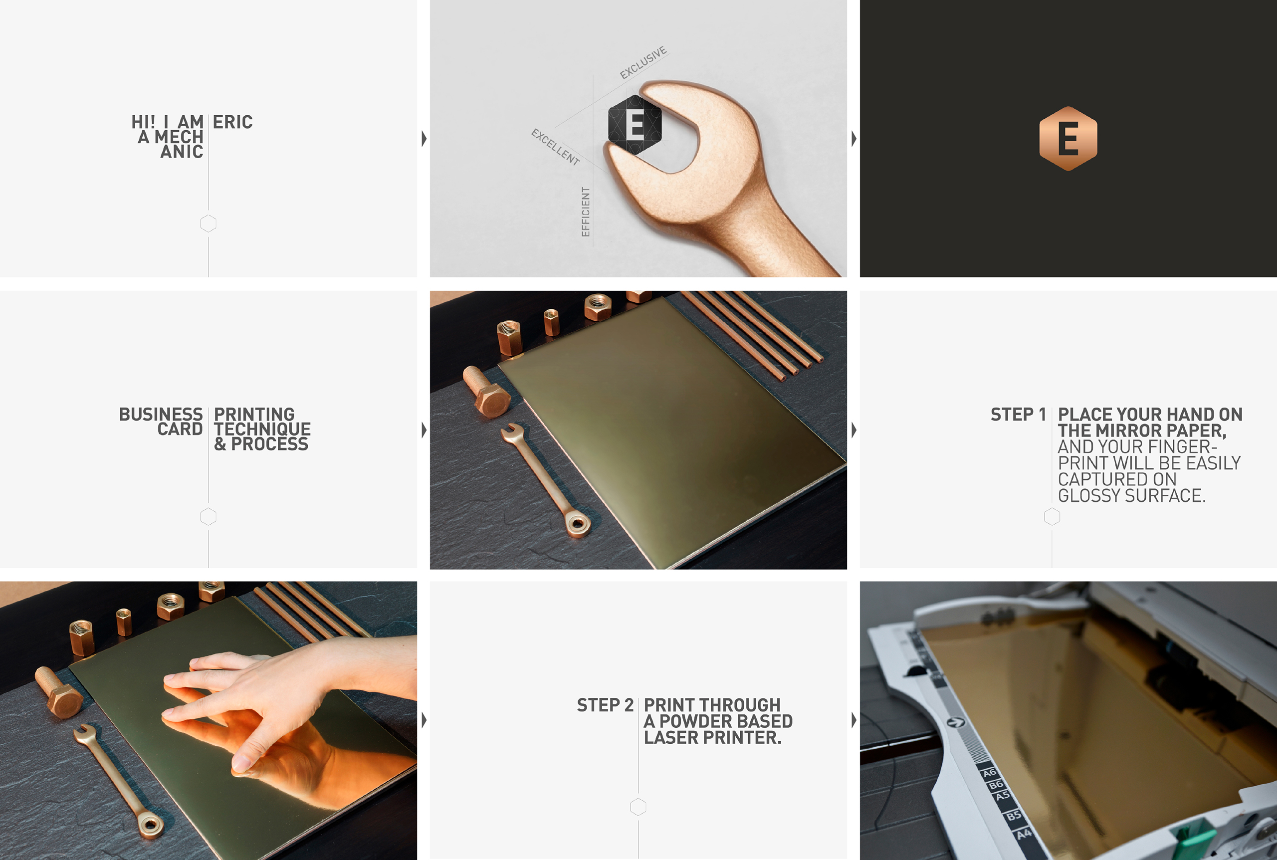
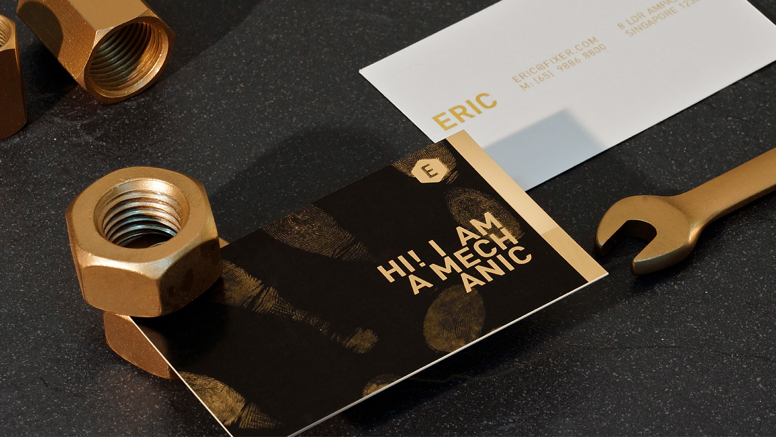
“The fingerprint on the personalised name card highlights his craftsmanship and the hands-on nature of his work.”
Client
Exclusive Bike Services
Discipline
Branding, Creative Direction
Sector
Manufacturing & Industrials