BCA Gallery
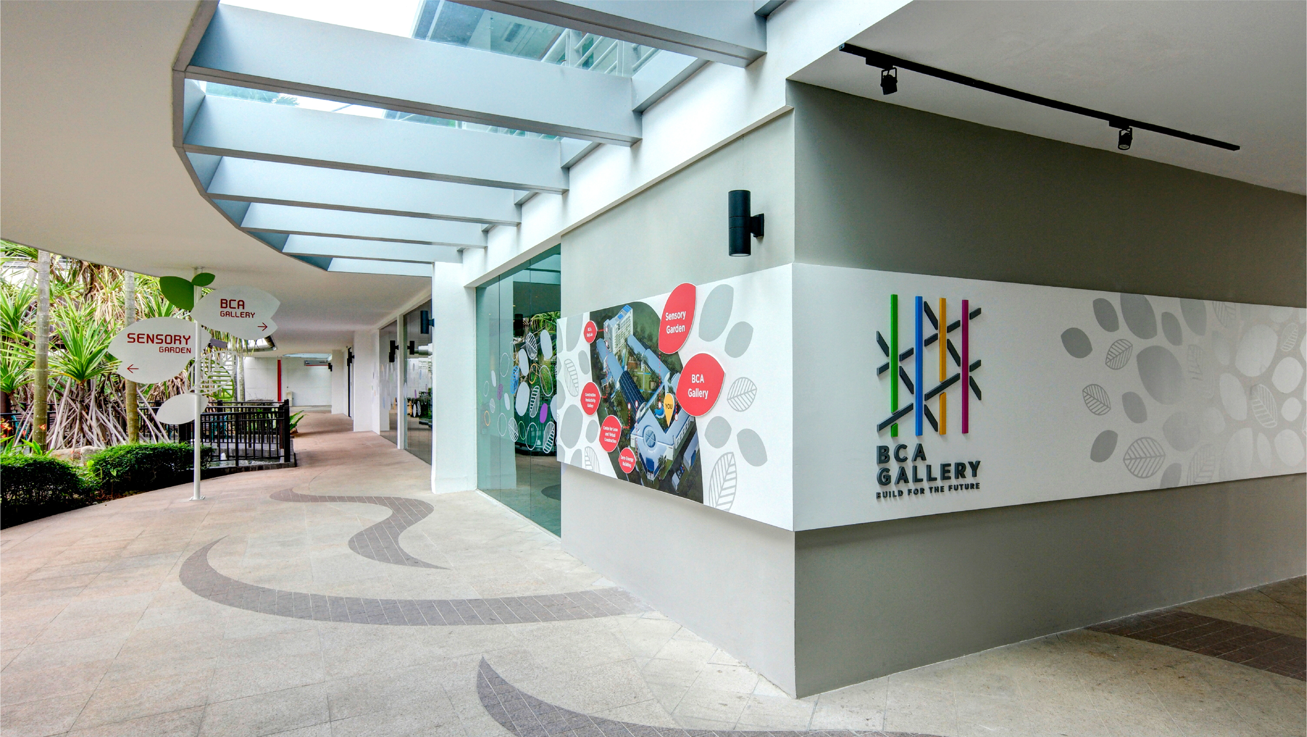
“Brand identity, art direction and exhibition graphics for BCA Gallery in Singapore”
Build for the Future
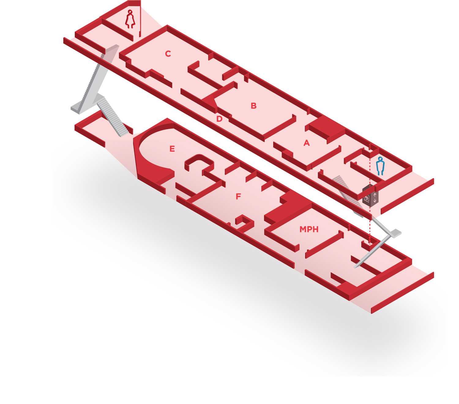
The Gallery was formerly a single-level showcase, but now spans two floors and features six distinct zones, each with its own multimedia and interactive components for visitors to discover the transformation of Singapore’s construction and building industry over the decades.

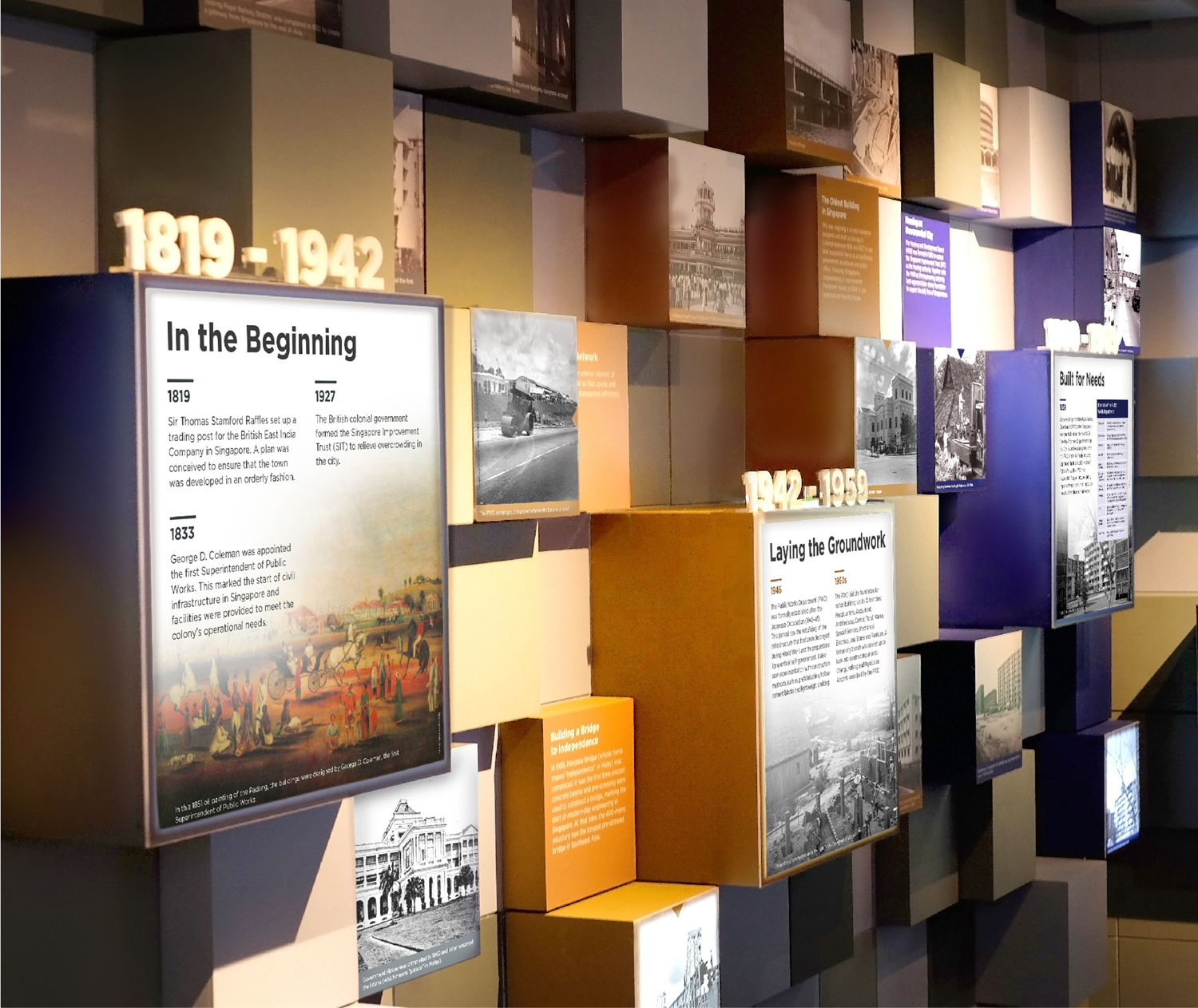
Zone A: Moving Forward
Visitors are brought through a progression of key milestones in BCA’s history. These milestones are illustrated via a visual installation of blocks.
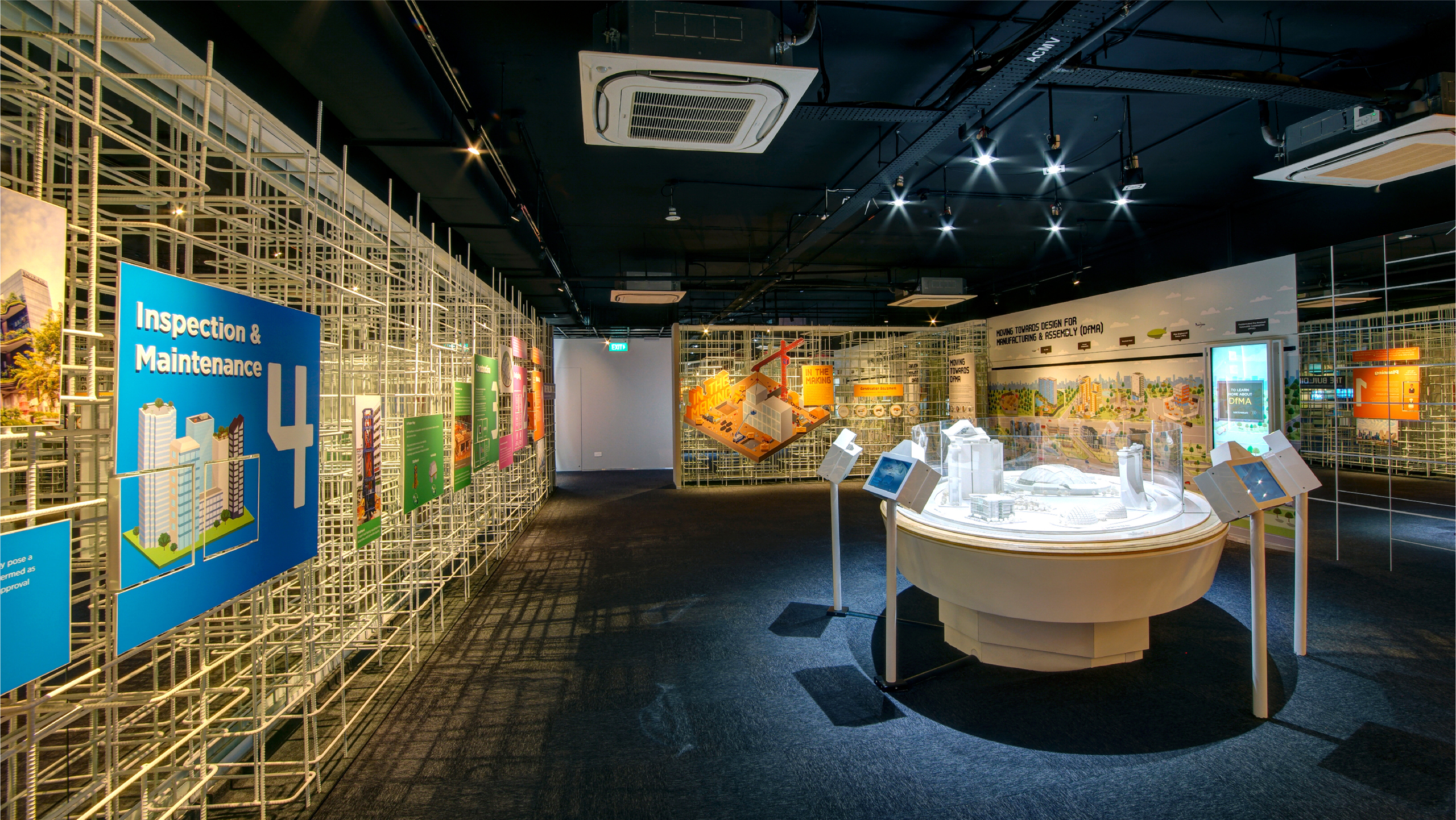
Zone B: The Makings of Our City
A ‘behind-the-scenes’ look at the Makings of Our City, which unveils the ‘invisible works’ done by BCA.
The various aspects of construction in the built environment are depicted and presented in the form of a stylised tactile exhibit for visitors to find out more.
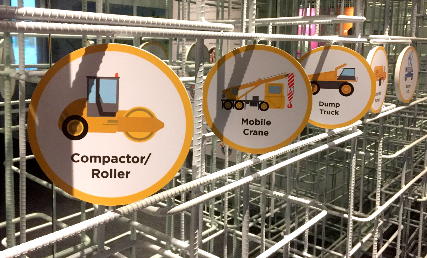
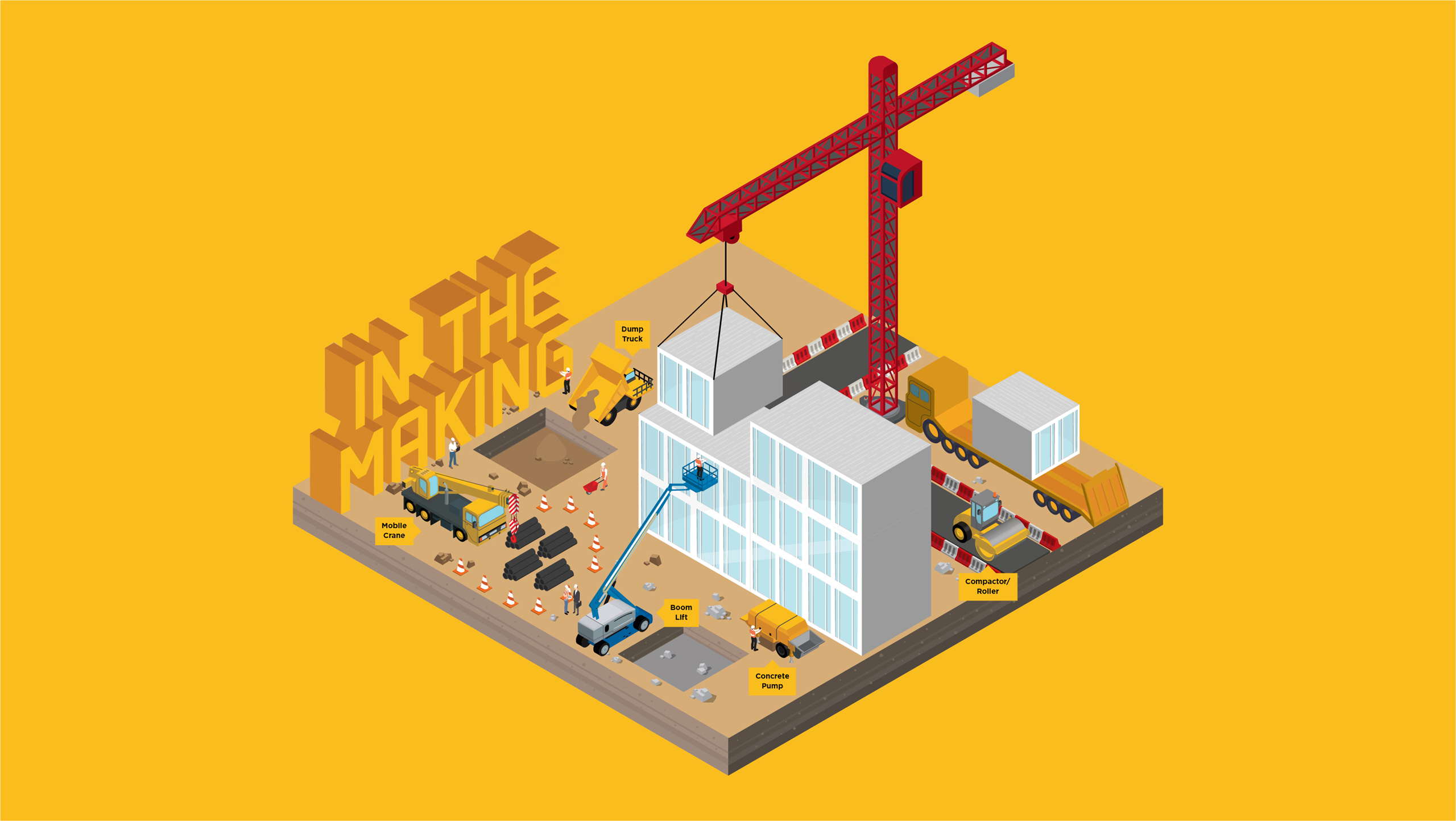
“Using large amount of infographic can be beneficial for visual appeal, improved comprehension, faster processing of information, and increased engagement with the audience.”
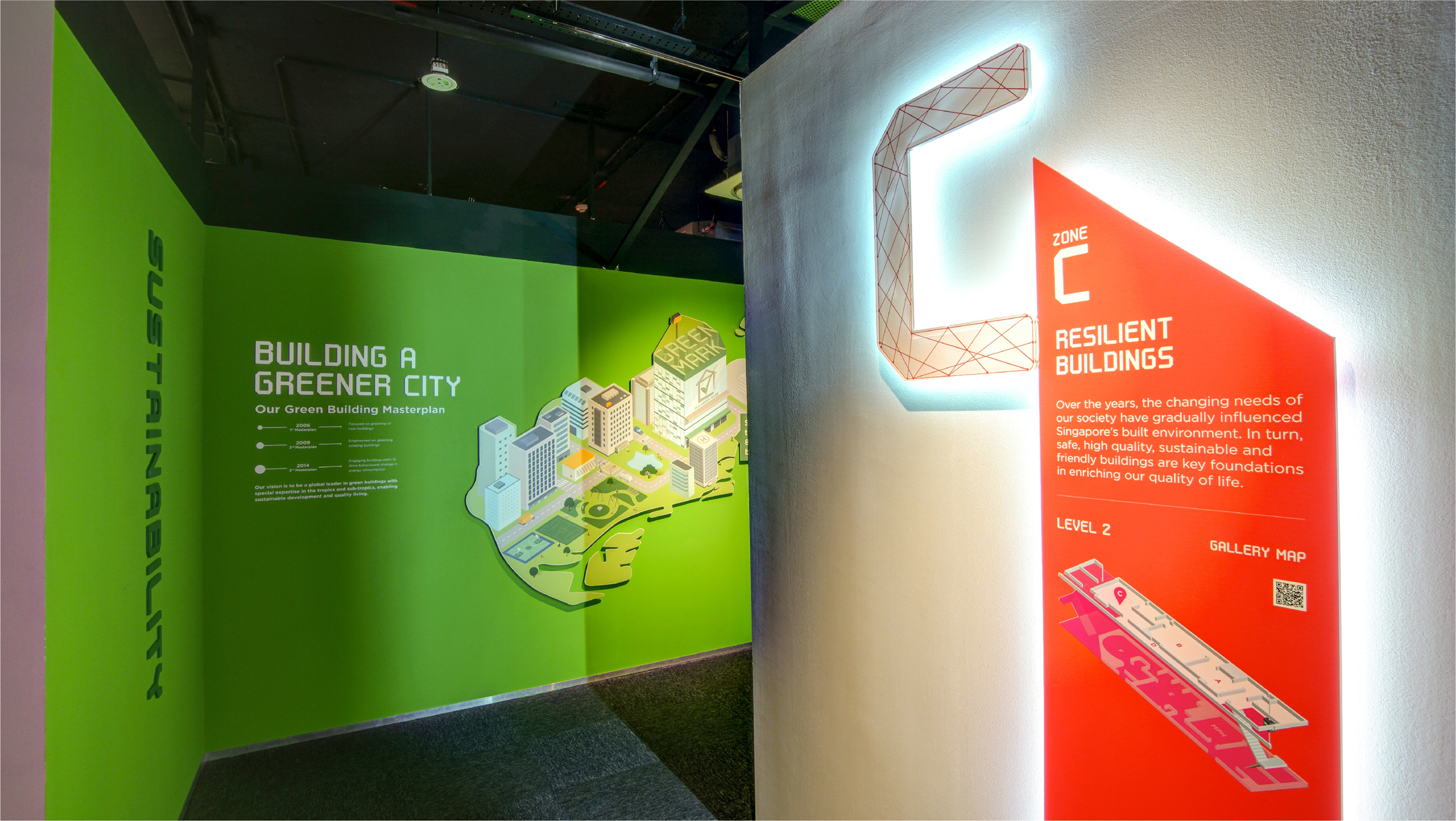
Zone C: Resilient Buildings
After learning about the works involved in design and construction stage, visitors move into a space which illustrates BCA’s four pillars of Safety, Quality, Sustainability and Friendly that have laid the foundation of Singapore’s built environment.
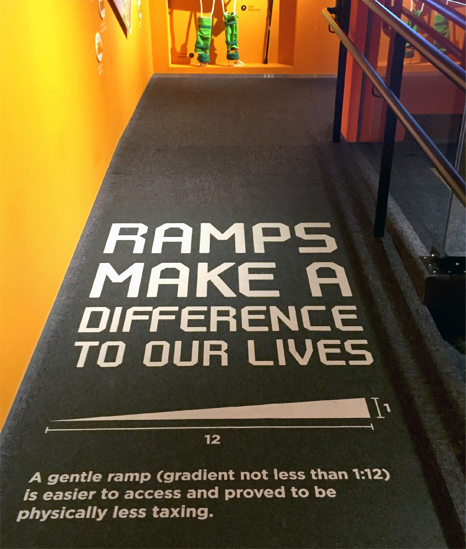
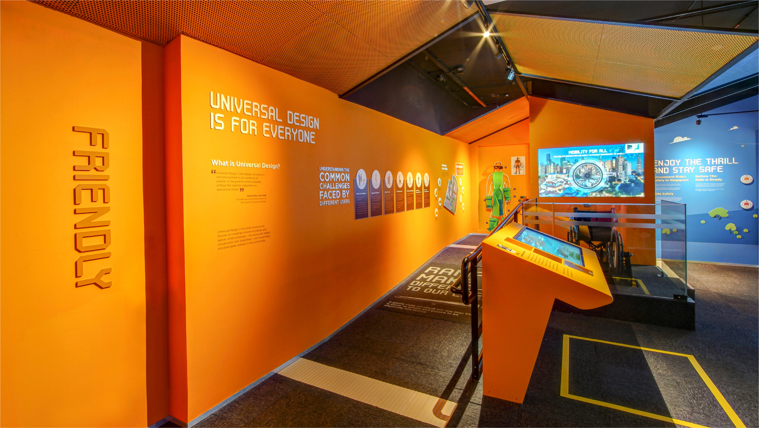
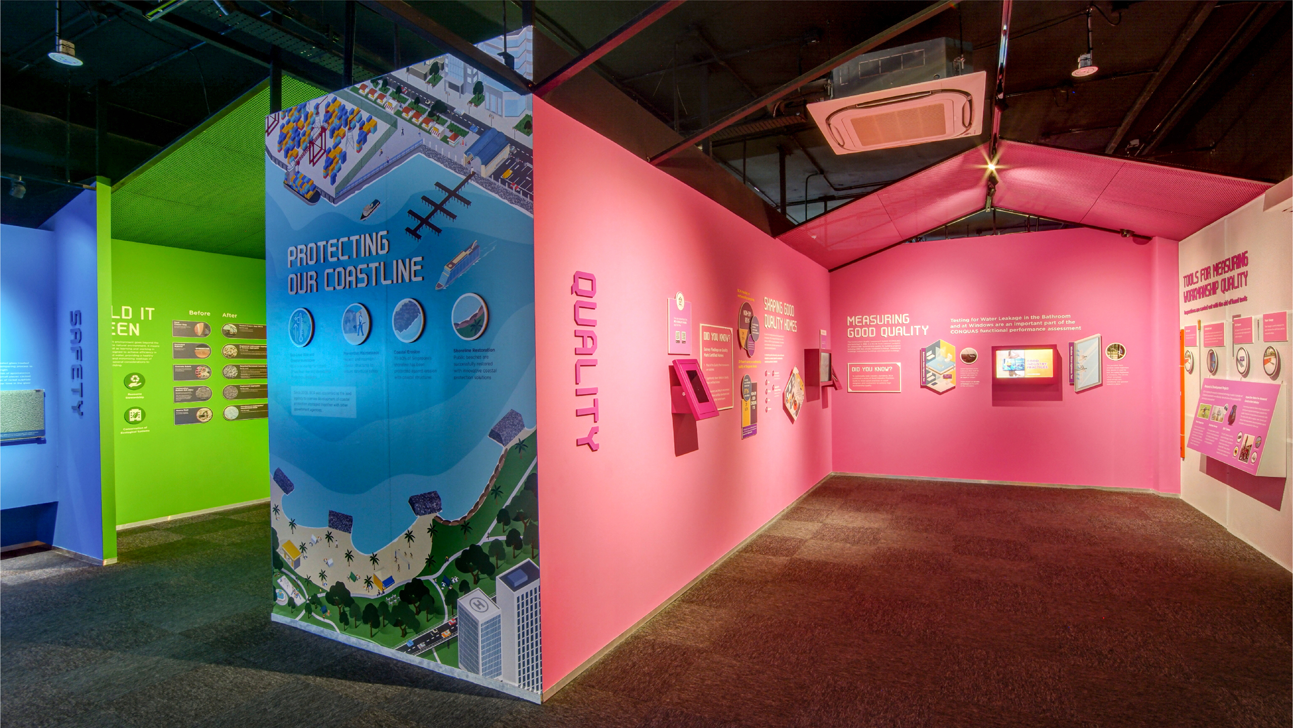
“Colours and visually striking graphics such as infographics are created to make content engaging and appealing for visitors.”
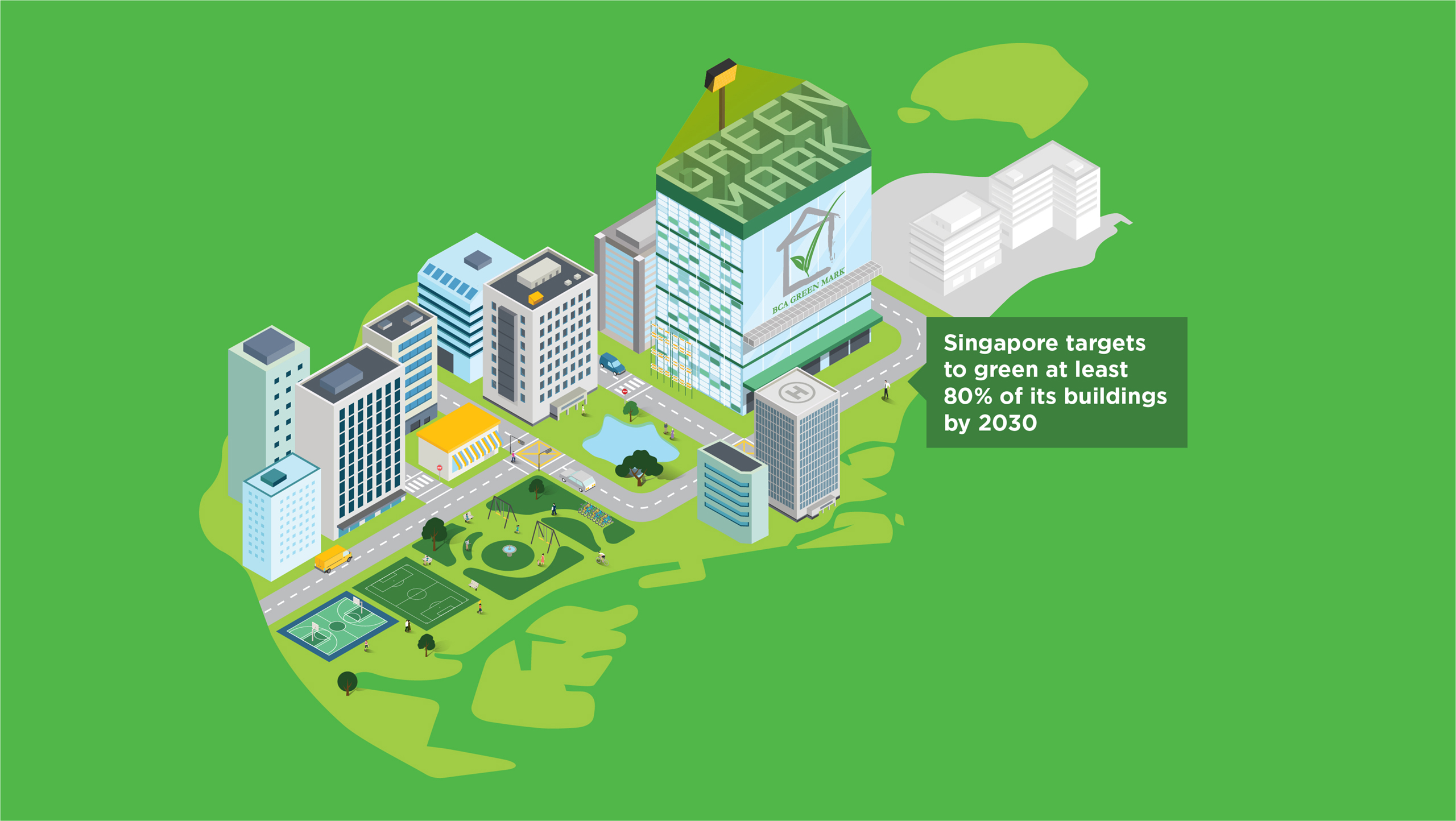
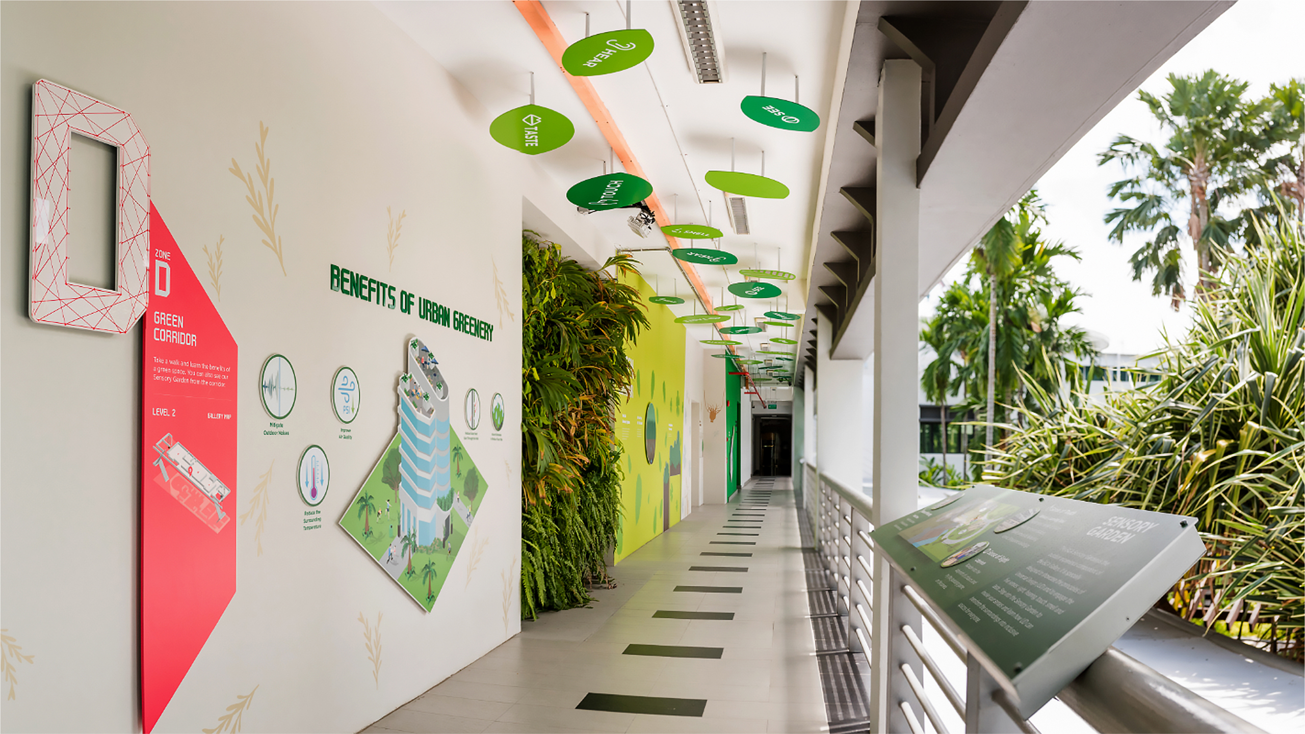
“The green corridor is designed to allow visitors to get a bird’s eye view of the Sensory Garden and identify the benefits of sustainability and universal design features in the built environment.”
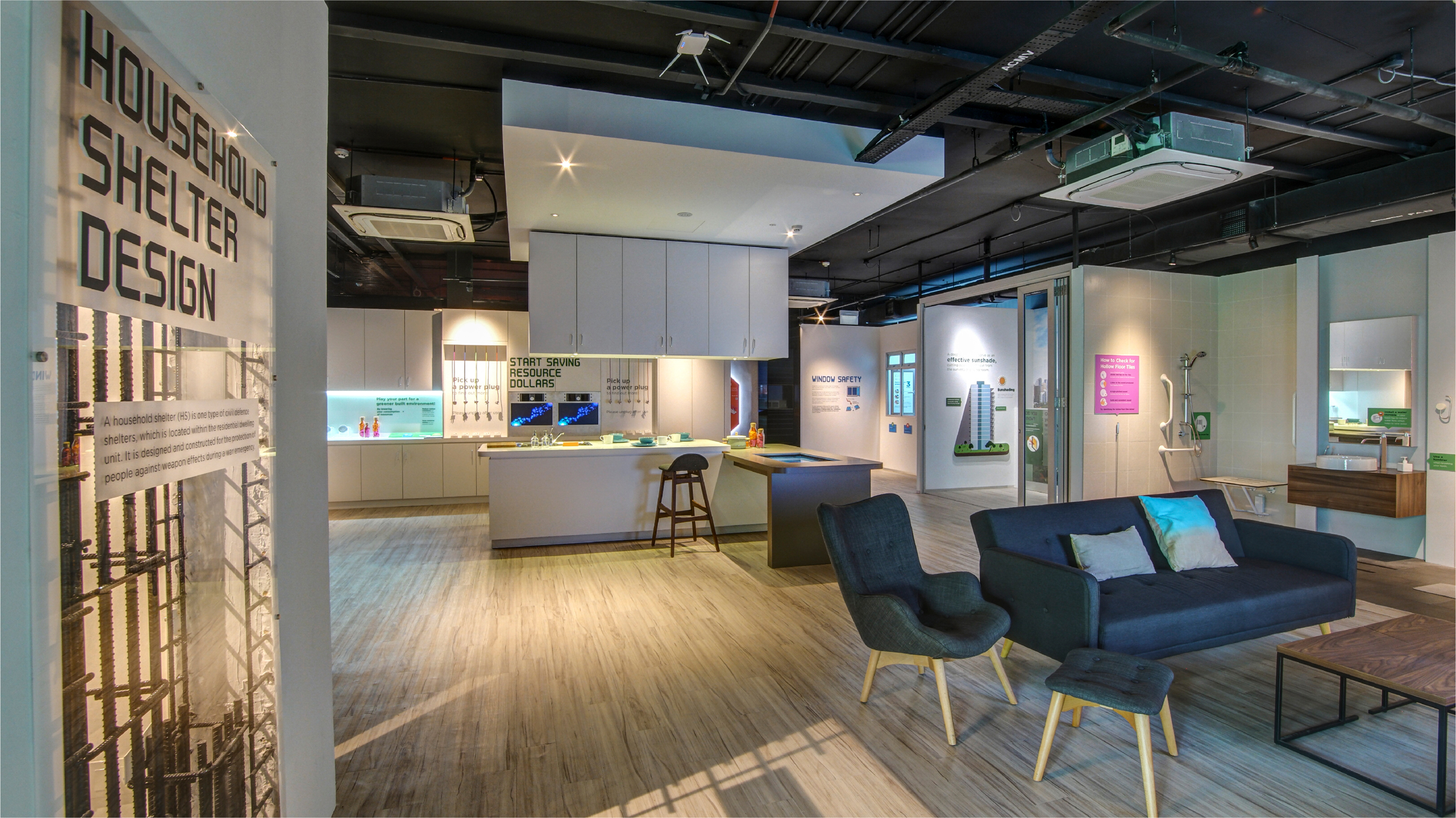
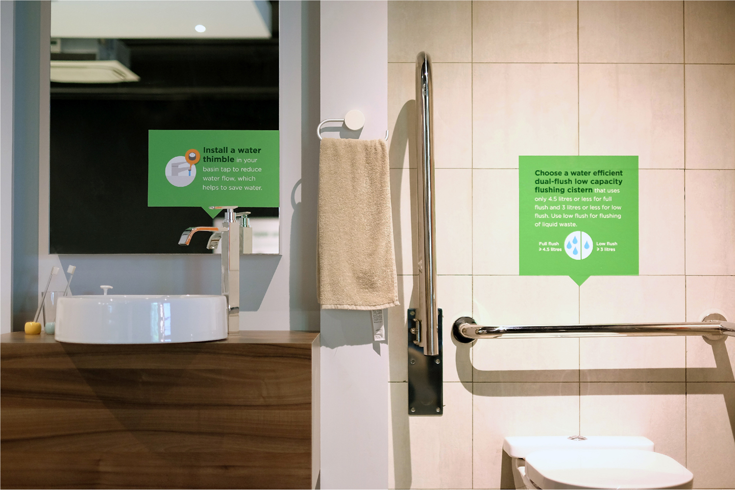
Zone E: Better Homes
Designed with sustainable and universal design features to resemble a real home. The content points are integrated throughout the “home” so that visitors can learn more about universal design and sustainability components.
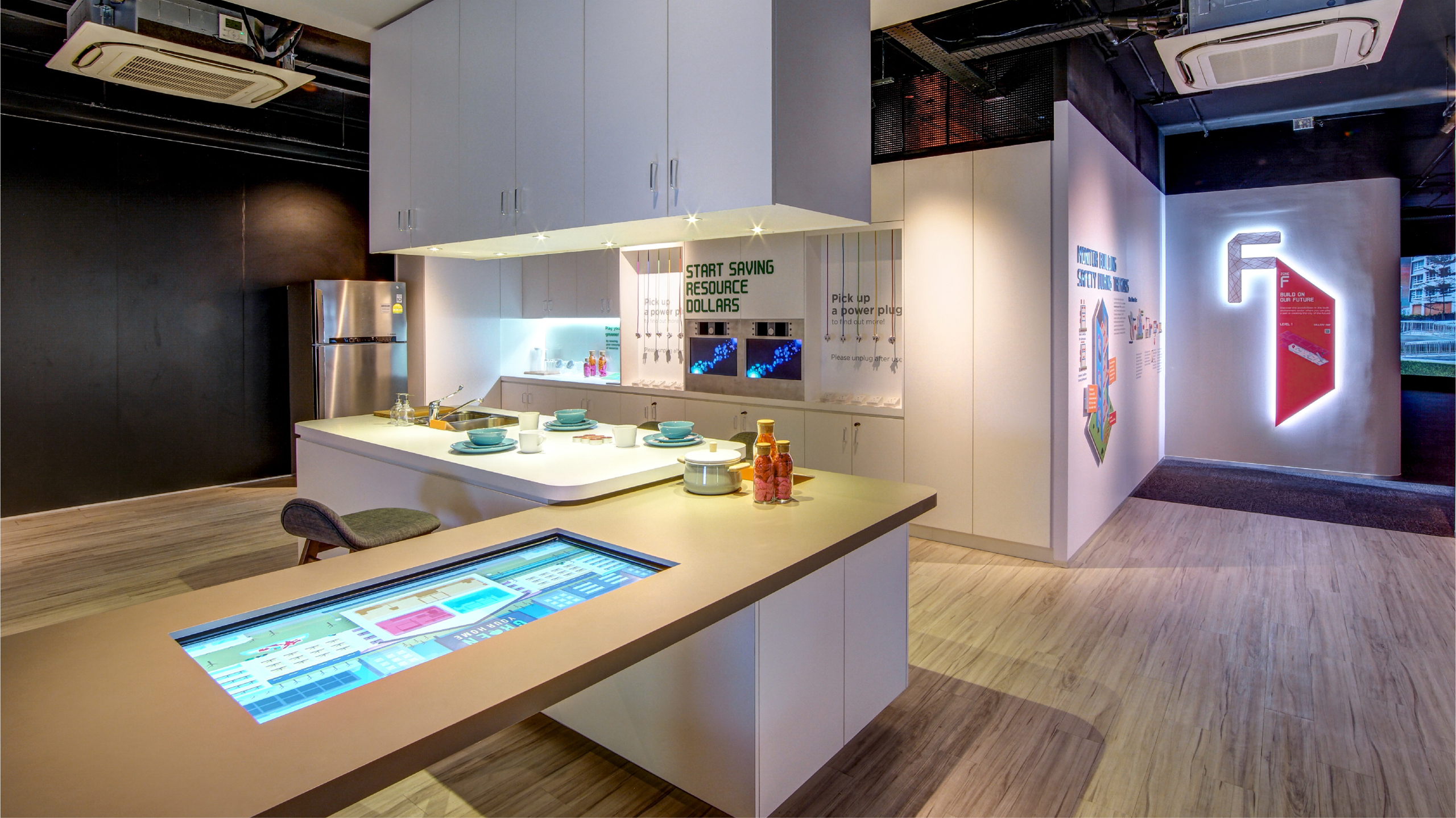
“Interactive content including motion graphics and infographics are produced for the multi-touch screen exhibit which is seamlessly embedded in the barrier-free kitchen table.”
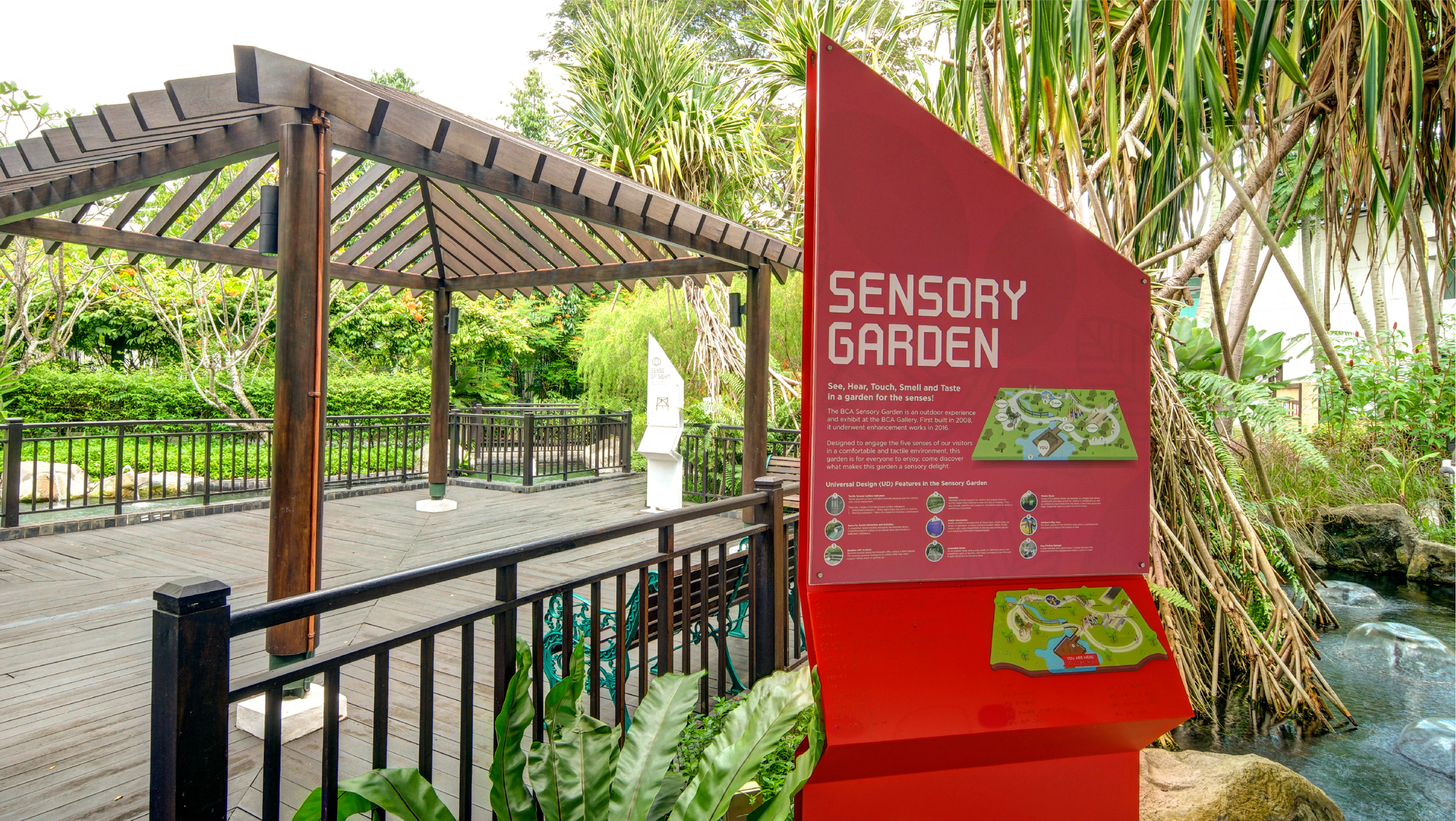
The BCA Sensory Garden
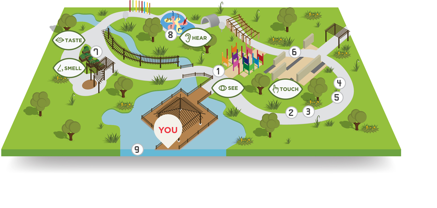
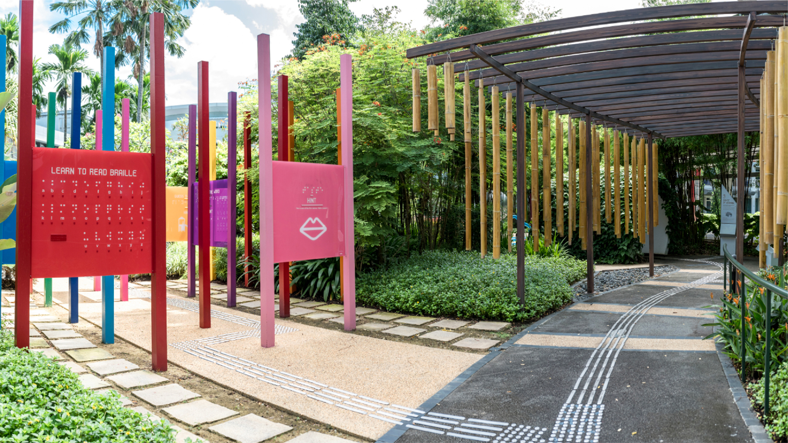
The BCA Sensory Garden is an outdoor experience created to engage visitors’ five senses through different exhibit methods.
Branding
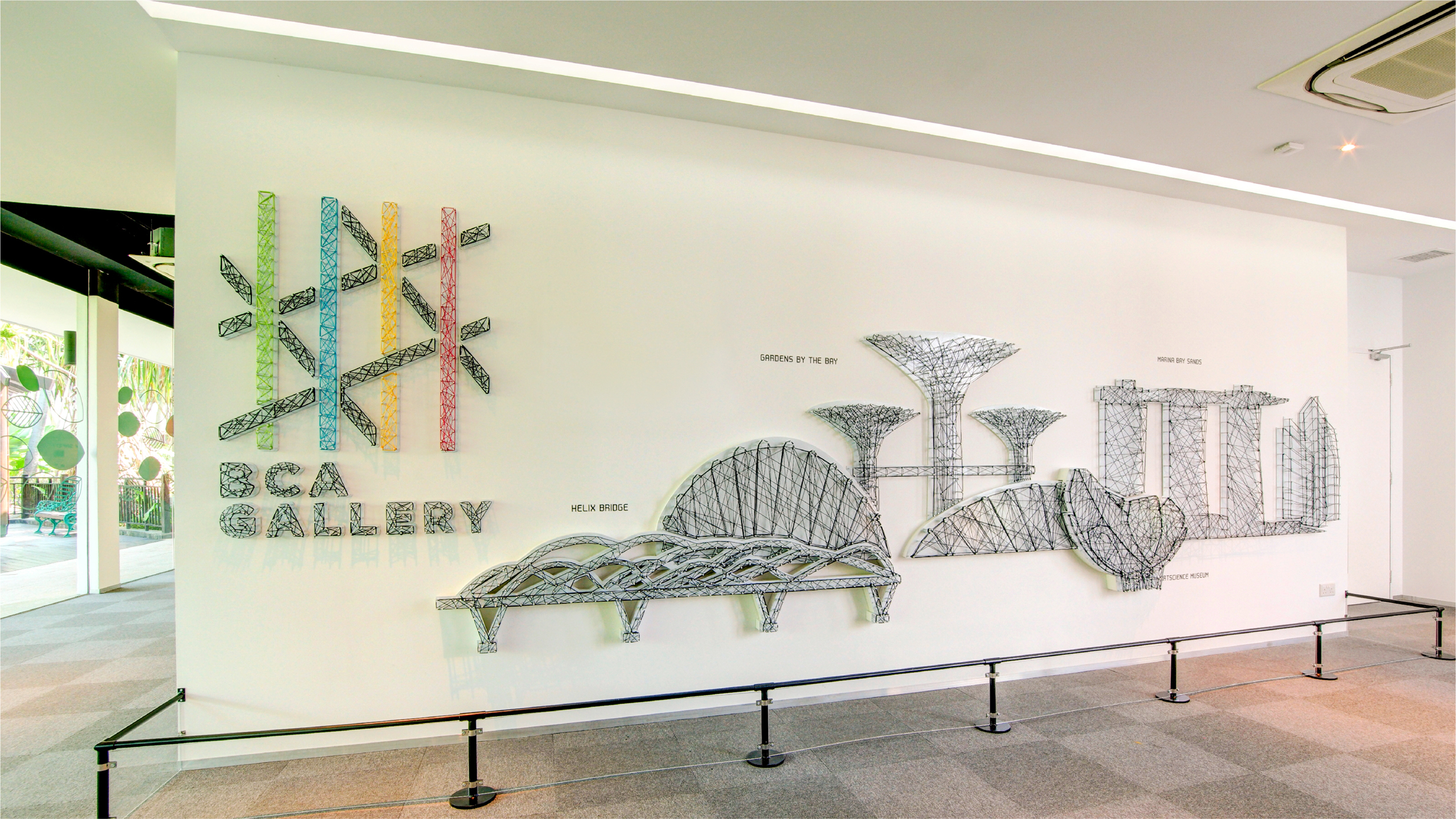
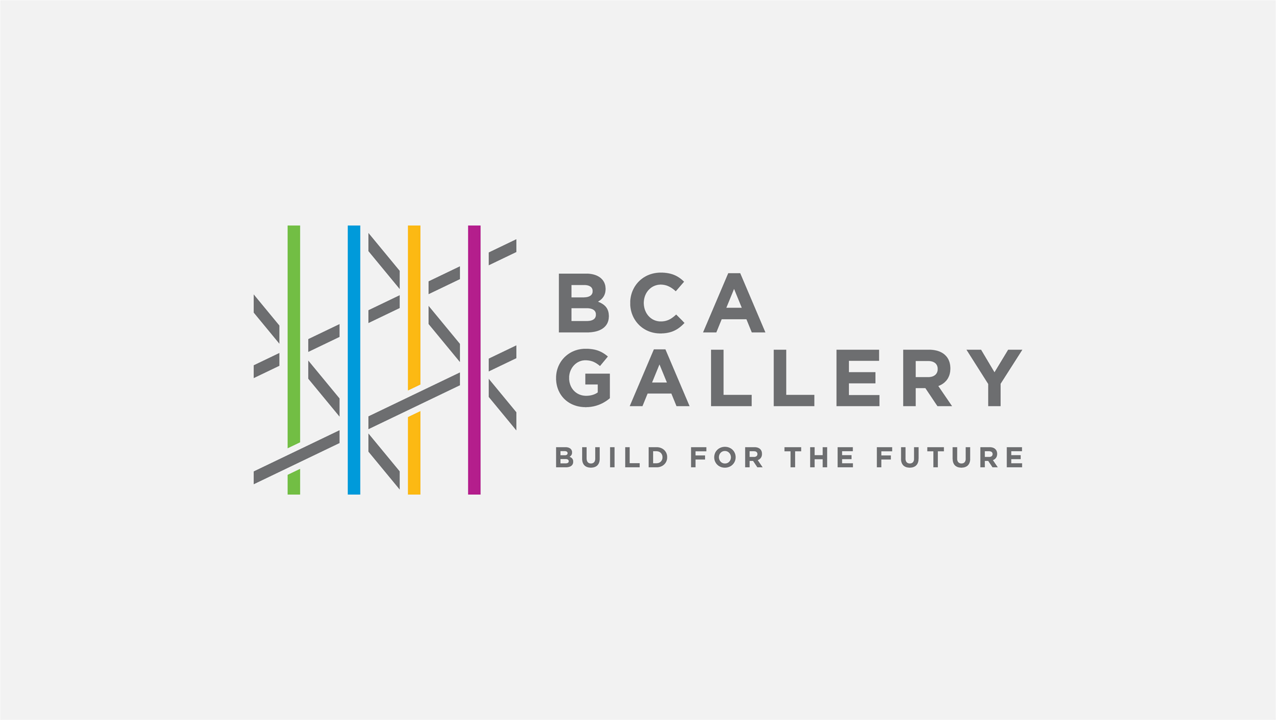
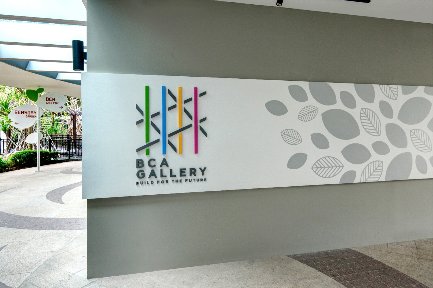
The gallery logo depicts the fundamentals of the built environment as well as the role of the BCA. Bold lines are used to create a grid structure that represents the blueprint and foundation of the built environment. The interlacing pillars demonstrate BCA’s critical role. The 4 coloured pillars represent the mission of BCA which is to shape a safe, high quality, sustainable and friendly built environment. The logo is also intended to inspire a paradigm shift in how people perceive the built environment – what lies beyond the impressive building façade, the built environment is both art and science, as well as a work of nation building.
A tagline is included as part of the logo to convey BCA’s vision of a future-ready built environment in Singapore.
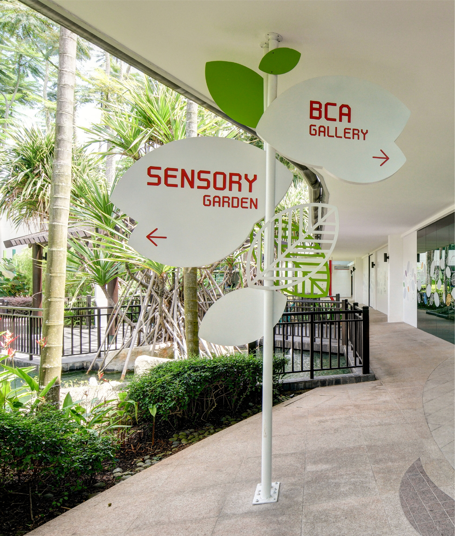
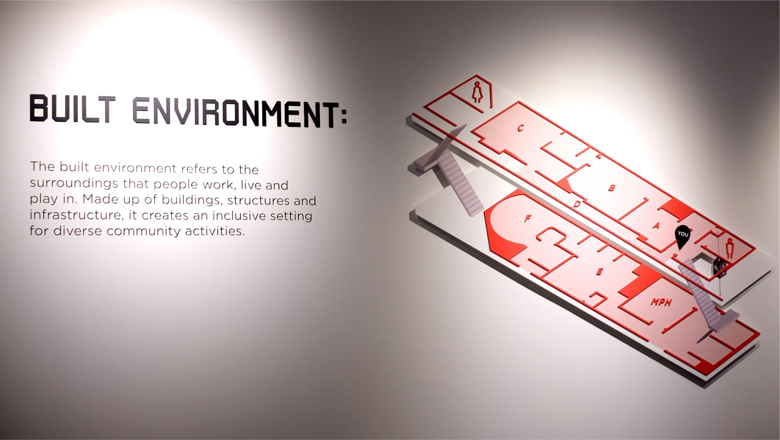
Wayfinding
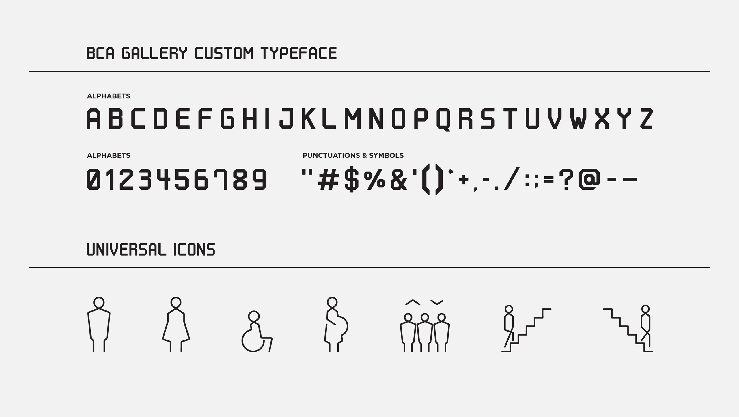
A special typeface was created as part of the gallery’s overall visual identity.
The rebar used in building projects serves as inspiration for a condensed typeface that adds impact to titles and headlines.
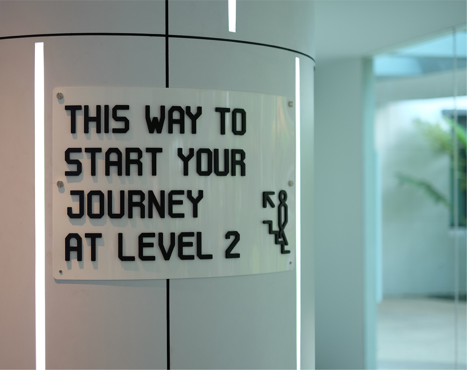
A system of construction-inspired icons was also created by the design team. These icons, which take the form of a continuous line, can be found throughout the gallery.
Client
Building and Construction Authority
Collaborators
Pico, Zarch
Discipline
Art Direction, Branding, Exhibition Graphics, Motion Graphic, Illustration, Wayfinding,
Environmental Graphics
Sector
Civic & Public