The Orange Academy
” Brand identity and web design for education provider who nurtures children to be active learners with quality education and care. “
A Symbol of Nurturing Environment
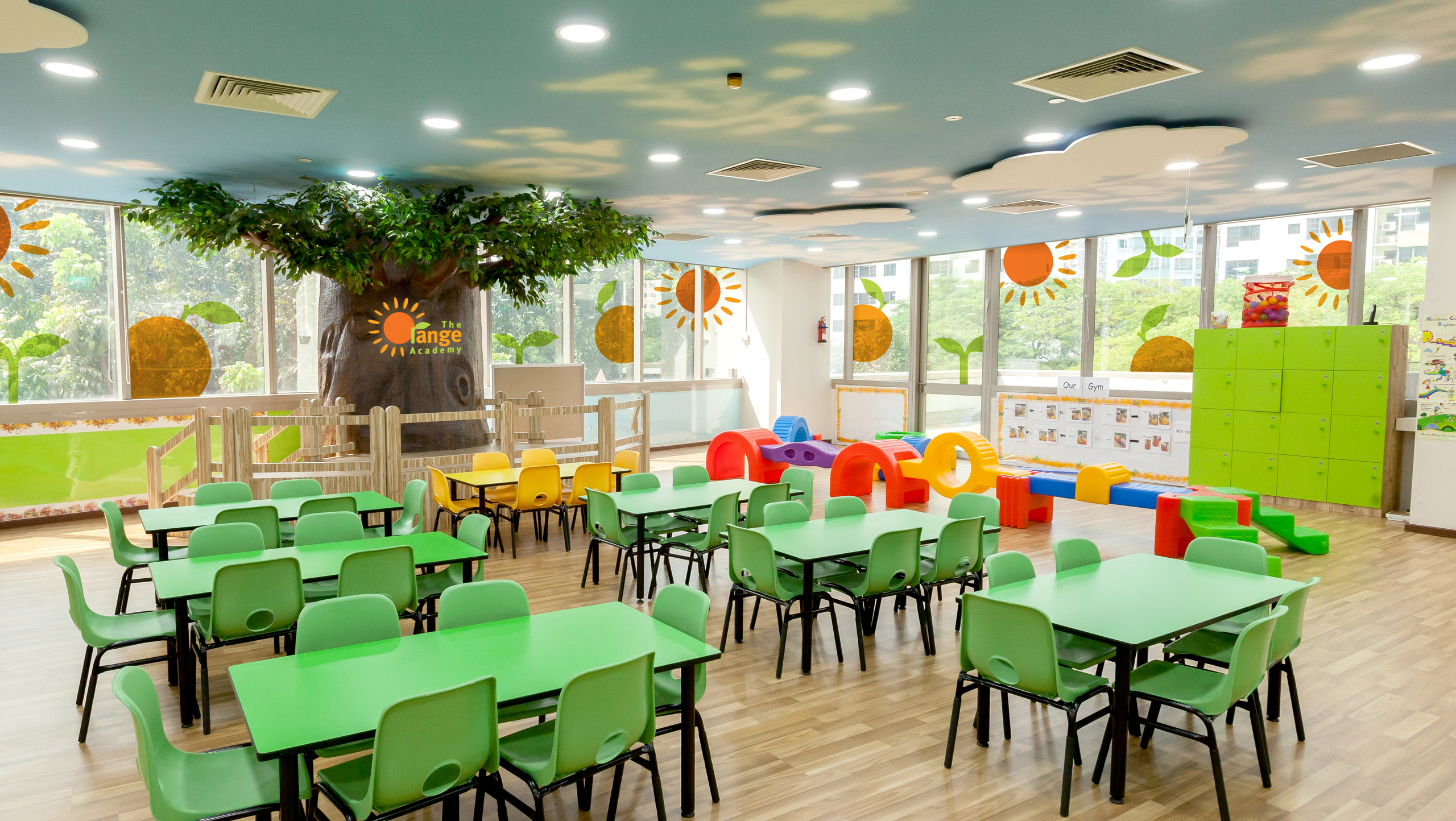
Positive, vibrant, and kids-friendly – The Orange Academy logo consists of two graphic components: a little sapling under the sun and a fresh orange representing a positive habitat. The logo reflects the quality of the academy which is a nurturing environment for education and care for children.

“Positive imagery and graphic element are implemented across all platforms, from physical environment to web space.”


A Captivating Website
We envision an attractive and engaging website without compromising on its functionality and content. Based on the information, we designed easy-to-use web interfaces to help users concentrate on the content and move through it.


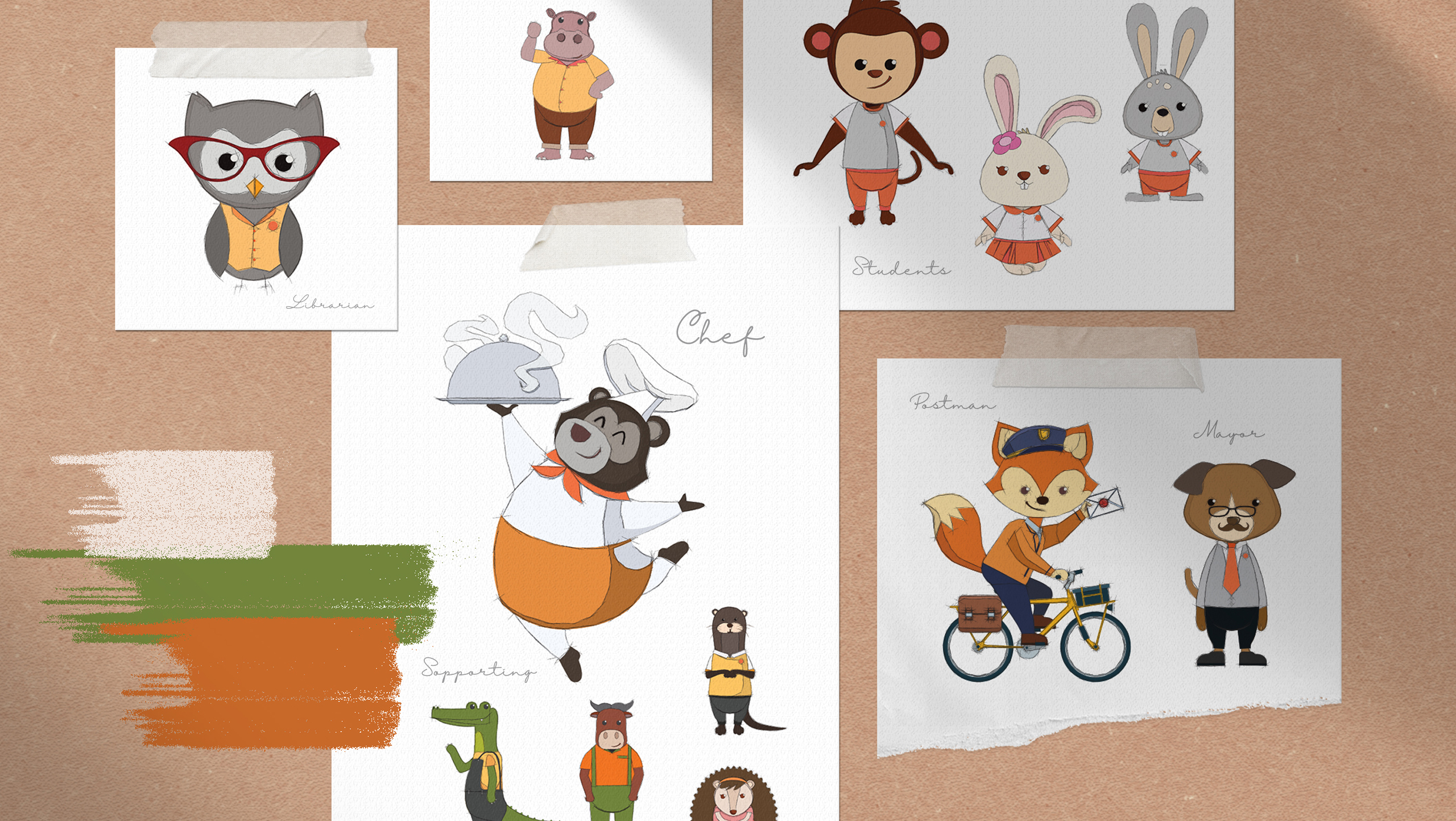
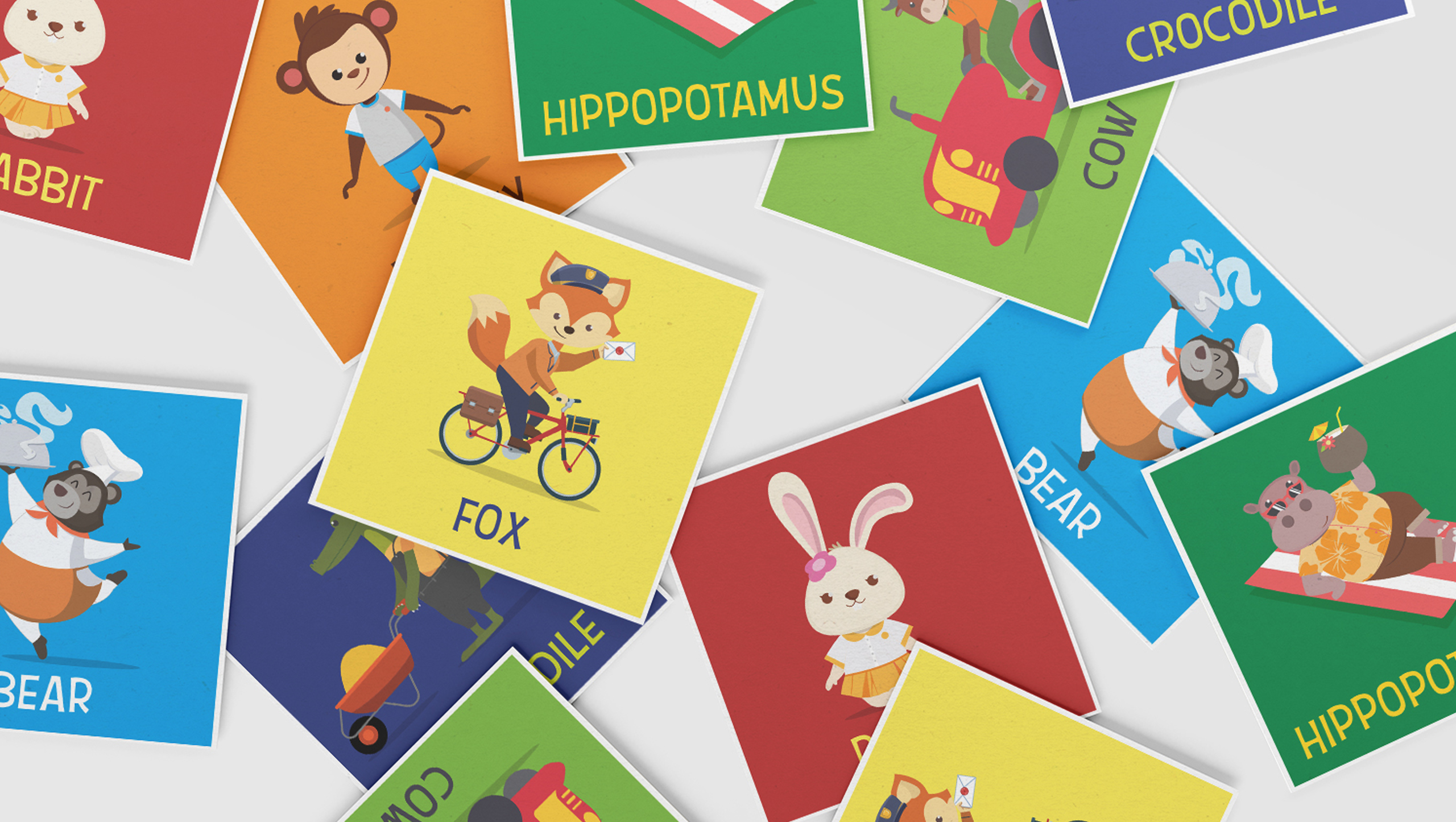
“We created a harmonious web space for its population of residence animals, resembling the school as a space where the young ones come to play and explore.”

“Engaging and entertaining, horizontal scrolling of the website reflects its fun and educational journey the school provides.”

Client
The Orange Academy
Collaborators
Amiko
Discipline
Branding, Digital Design
Sector
Education