Knackey
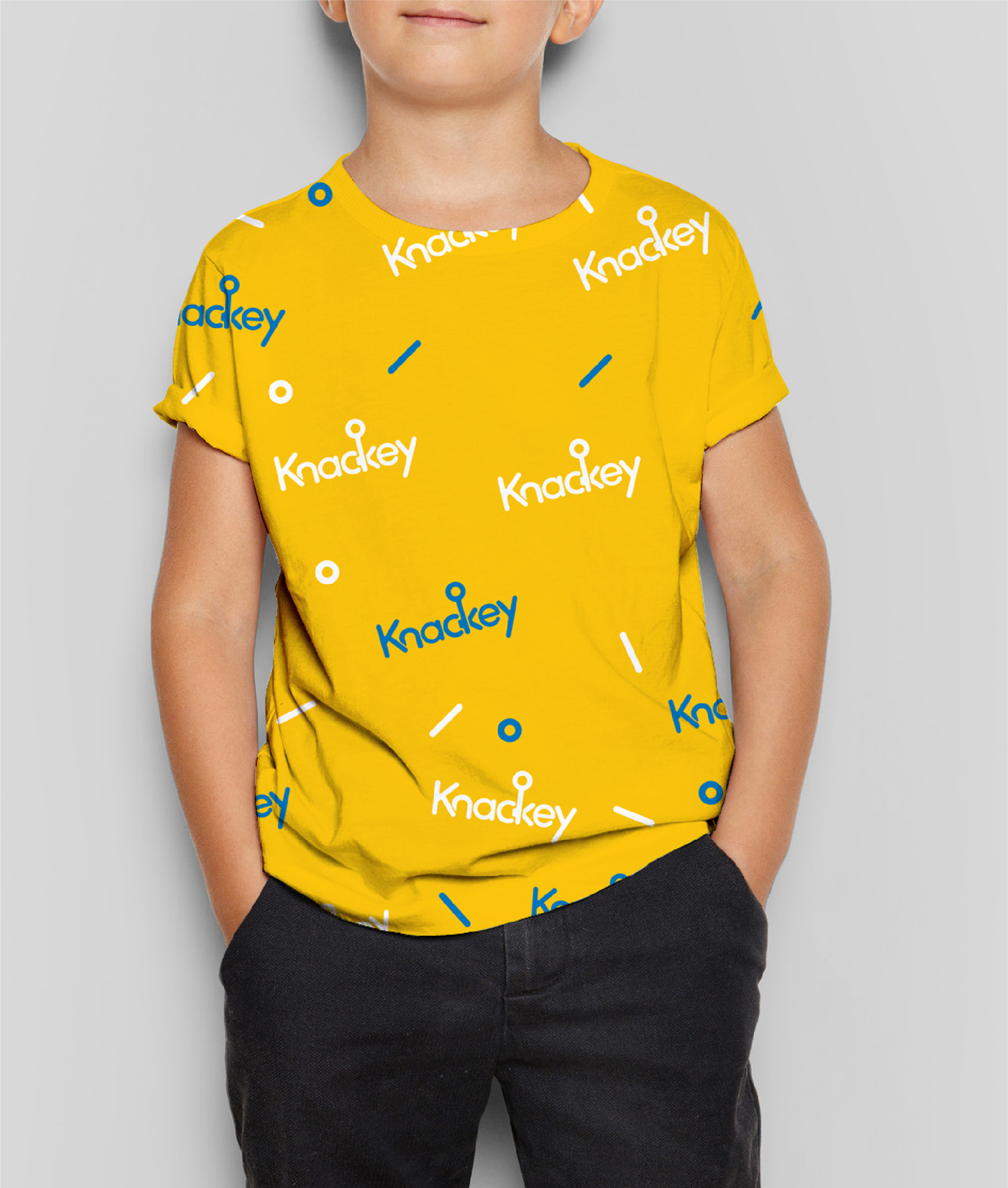
“Brand identity and packaging design for Knackey – a sub-brand of Singapore’s leading disposable food packaging provider, SKP.”
The meaning behind ‘Knackey’
The definition of knack is a clever way of doing something and also a natural ability or talent.
Combining the words “knack” and “key,” “KNACKEY” is all about giving everyone the keys to unlock their own “knacks”. KNACKEY is also about recognising and celebrating the creativity in every individual.
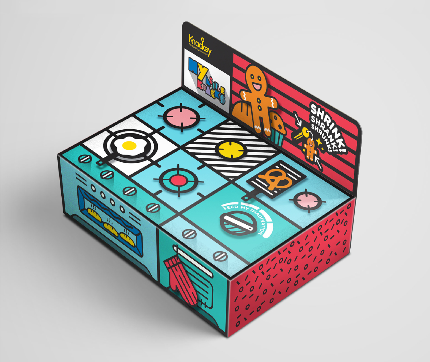
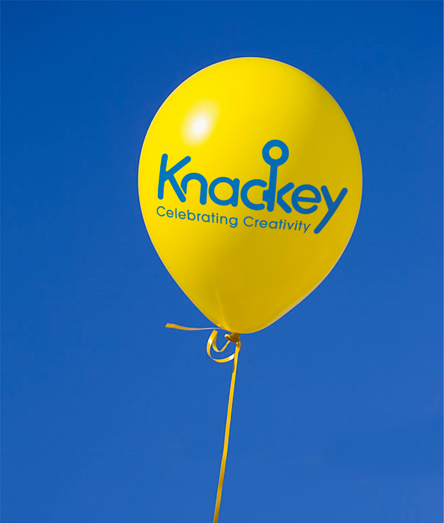
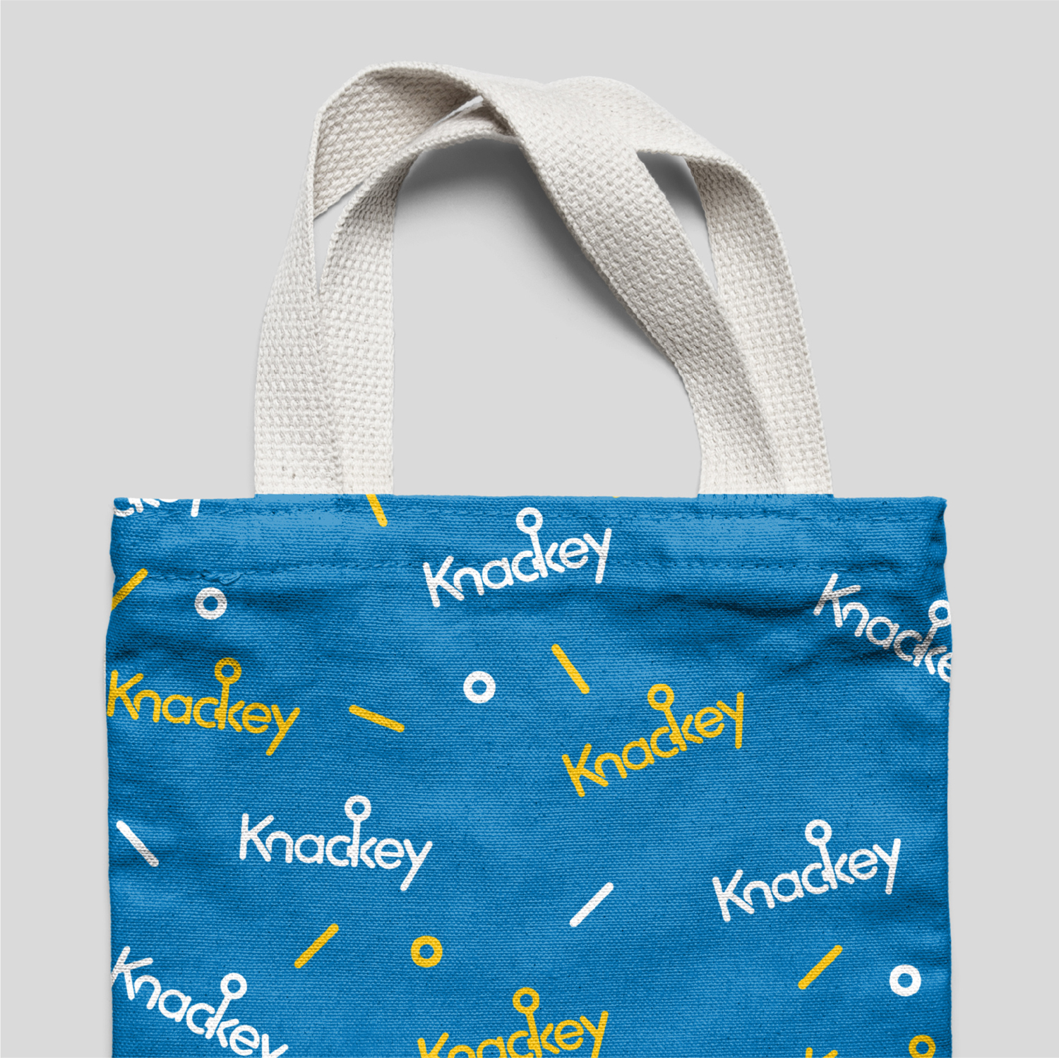
“The logo is a simplified typeface with a hidden key in the wordmark. This underlines the the brand philosophy of unlocking every child’s potential.”
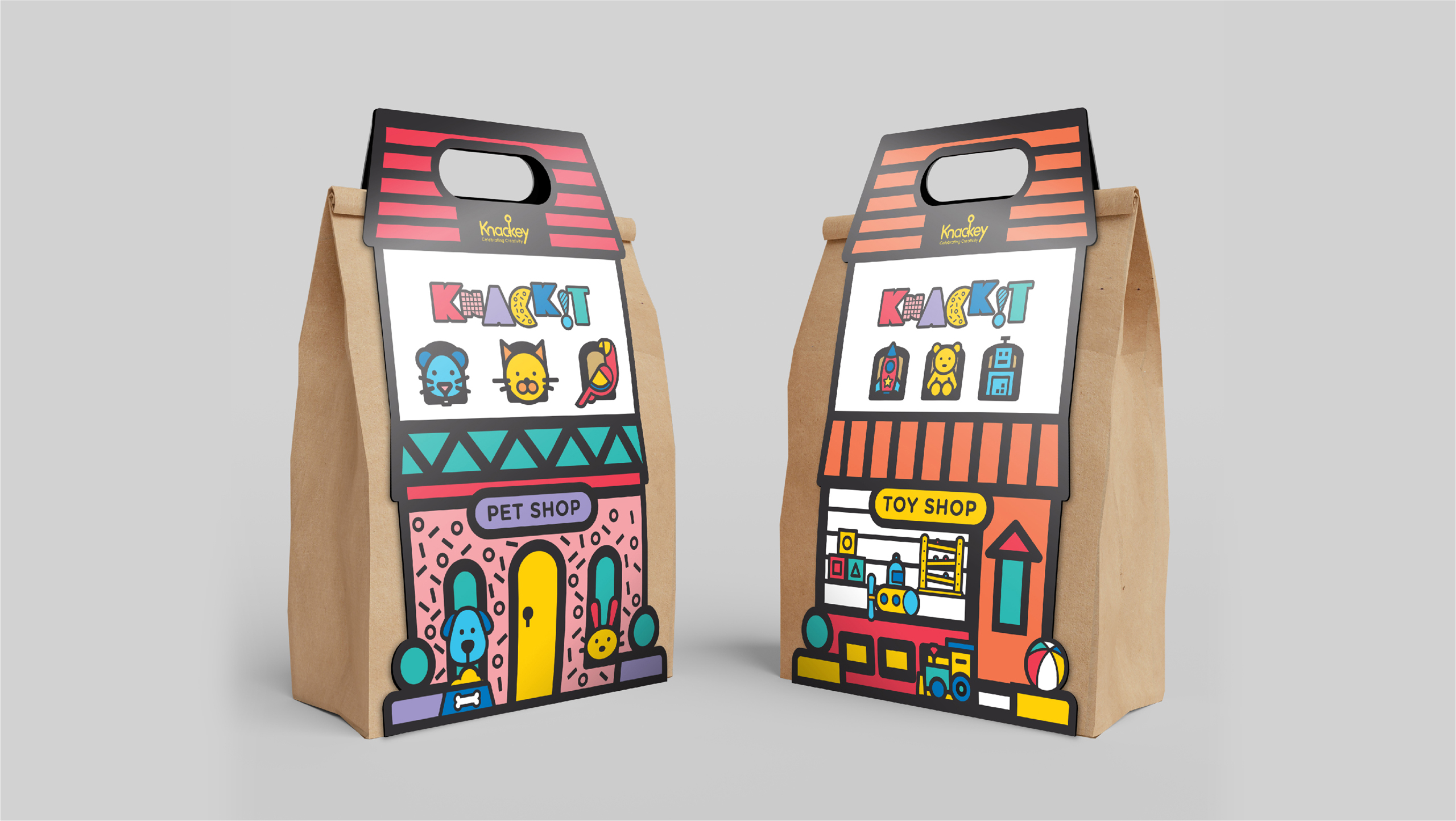
“Imagination. Fun. Creativity.”
Client
SKP
Discipline
Branding, Packaging
Sector
Retail