Zinnia
“Rebranding for a food manufacturing company specialise in automating various industries like food factories, central kitchens, and farms.”

From Legacy to High-Tech Precision
The original brandmark shape is retained to honour its legacy and maintain recognition among loyal customers. A modern, rounded treatment reflects the business philosophy of smooth, seamless production. The redesigned typeface features consistent rounded corners, while the continuous-line design of ‘Zinnia’ symbolises the company’s complete and integrated service line. The brand colours have been refreshed to a blue and silver palette, conveying a modern and tech-savvy identity.


“The rebrand is seamlessly adapted across all collaterals, maintaining consistency through the use of rounded corners, complemented by line graphic elements and clean, professional imagery, ensuring polished and trustworthy brand presence.”

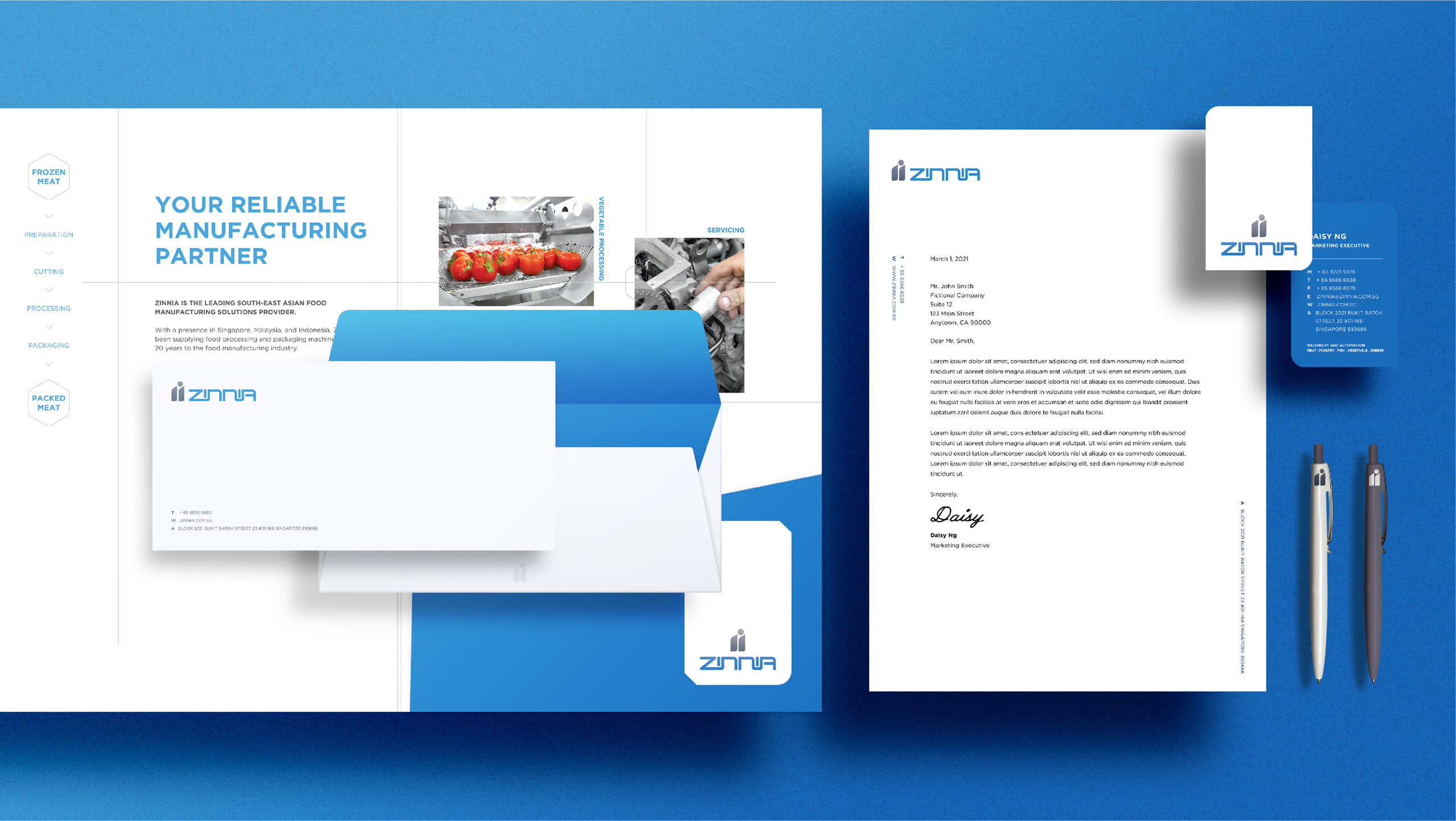


“The adaptation extends to corporate gifts and livery, featuring a bold and modern rendition of the logo that enhances visibility and ensures easy recognition.”


Client
Zinnia
Discipline
Branding, Marketing Collateral
Sector
Manufacturing & Industrials