Tien Hsia Branding and Website
“Brand identity and web design for Tien Hsia – best Chinese enrichment classes and tuition in Singapore.”

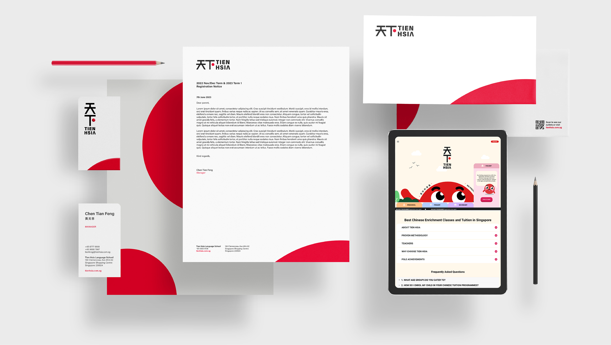
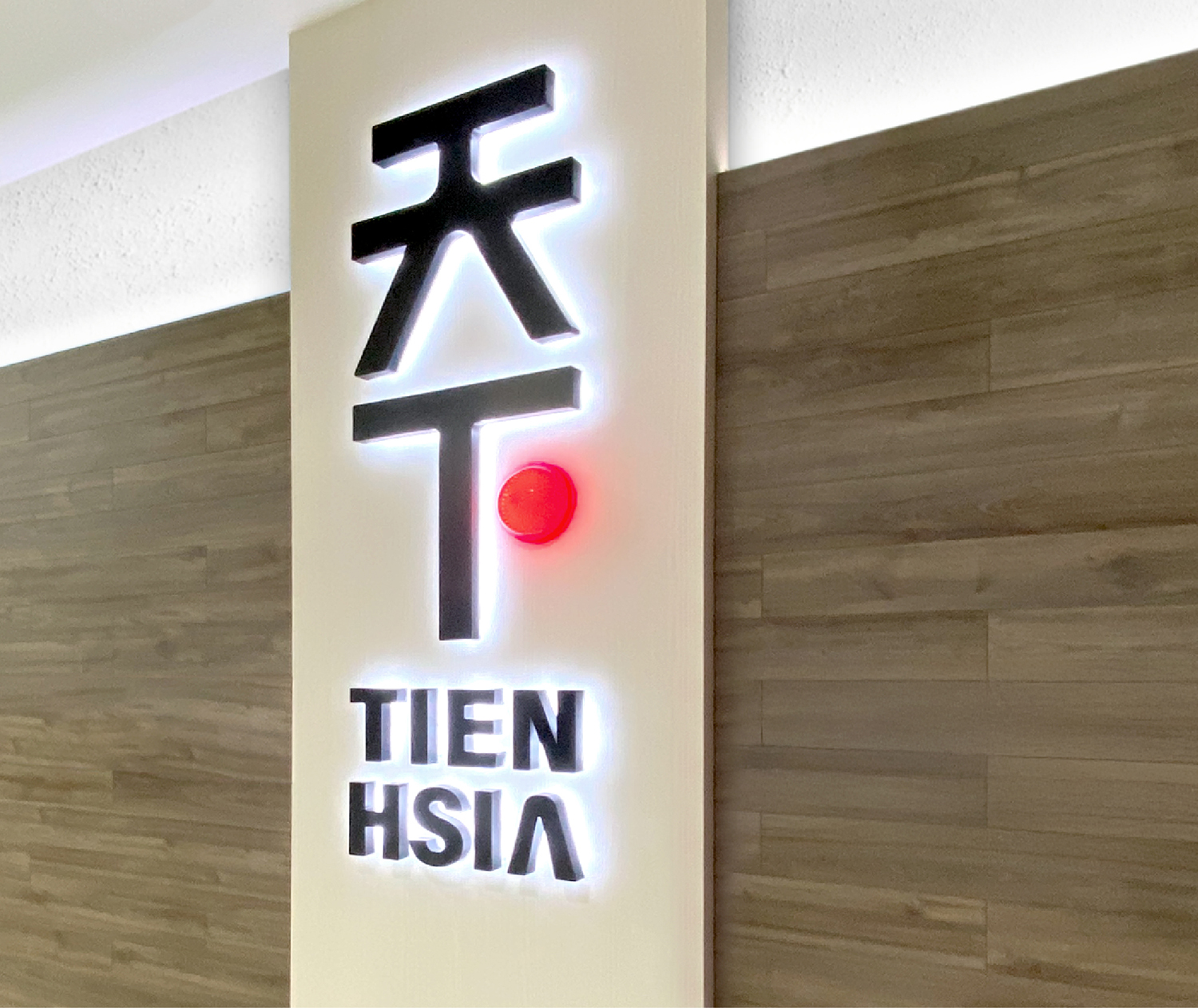
The Little Red Dot
The logo for Tien Hsia Language School features a small red dot, symbolising Singapore, to highlight the school’s local heritage and its dedication to nurturing Chinese language proficiency in Singaporean children. The clean, modern design reflects the school’s focus on effective, specialised teaching methods. Founded in 1989 and registered with the Ministry of Education, Tien Hsia’s logo encapsulates its legacy of fostering a love for Chinese language learning through tailored educational programmes.
“Crafted by experts, the signage design with a 3D little red dot symbolises Singapore, adding depth and visual appeal to the display.”

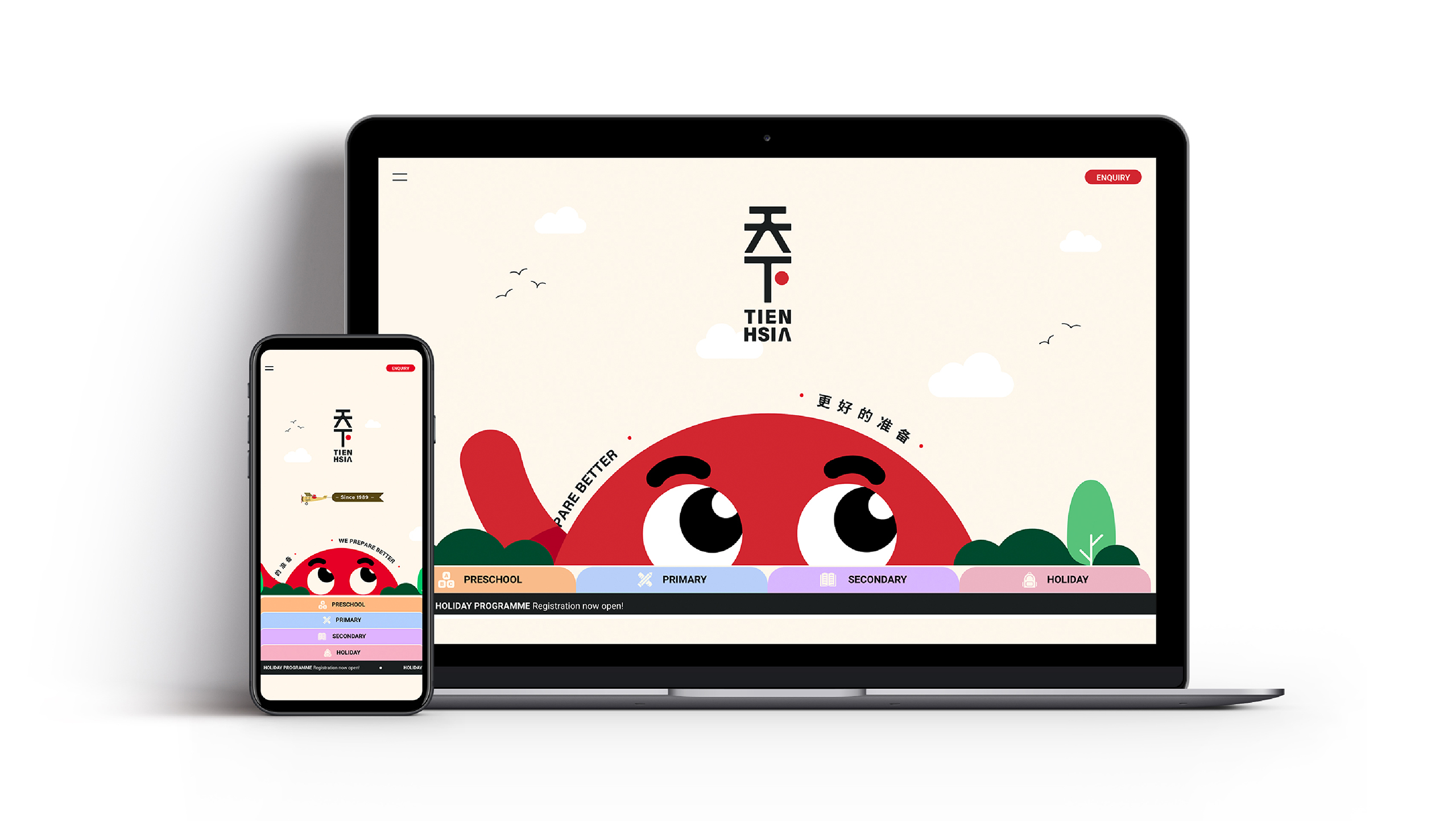
“Creative website design with colourful, fun, interactive features blends clear simplicity with sophistication, ensuring an engaging user experience.”
Client
Tien Hsia Language School
Discipline
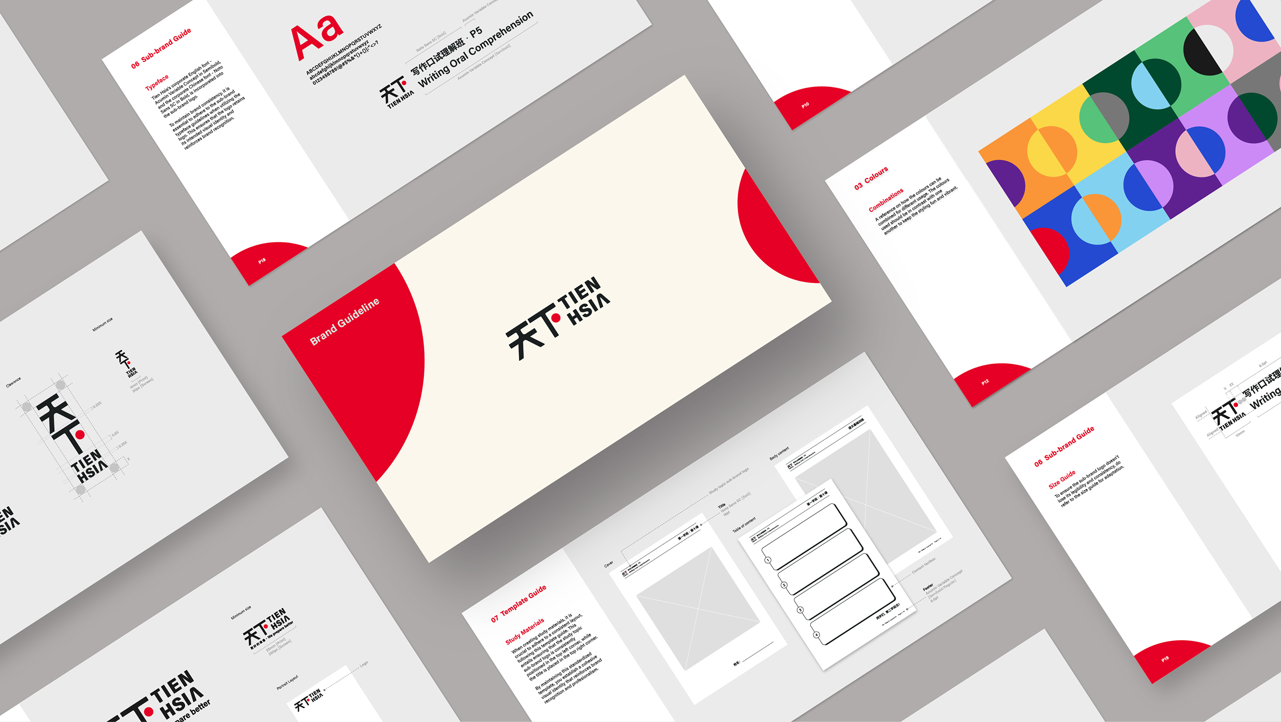
Branding, Brand Guideline, Mascot Design, Website Design
Sector
Education