Mapet’s
“Brand identity for Mapet’s Bakery – Where Every Bite Feels Like Home.”
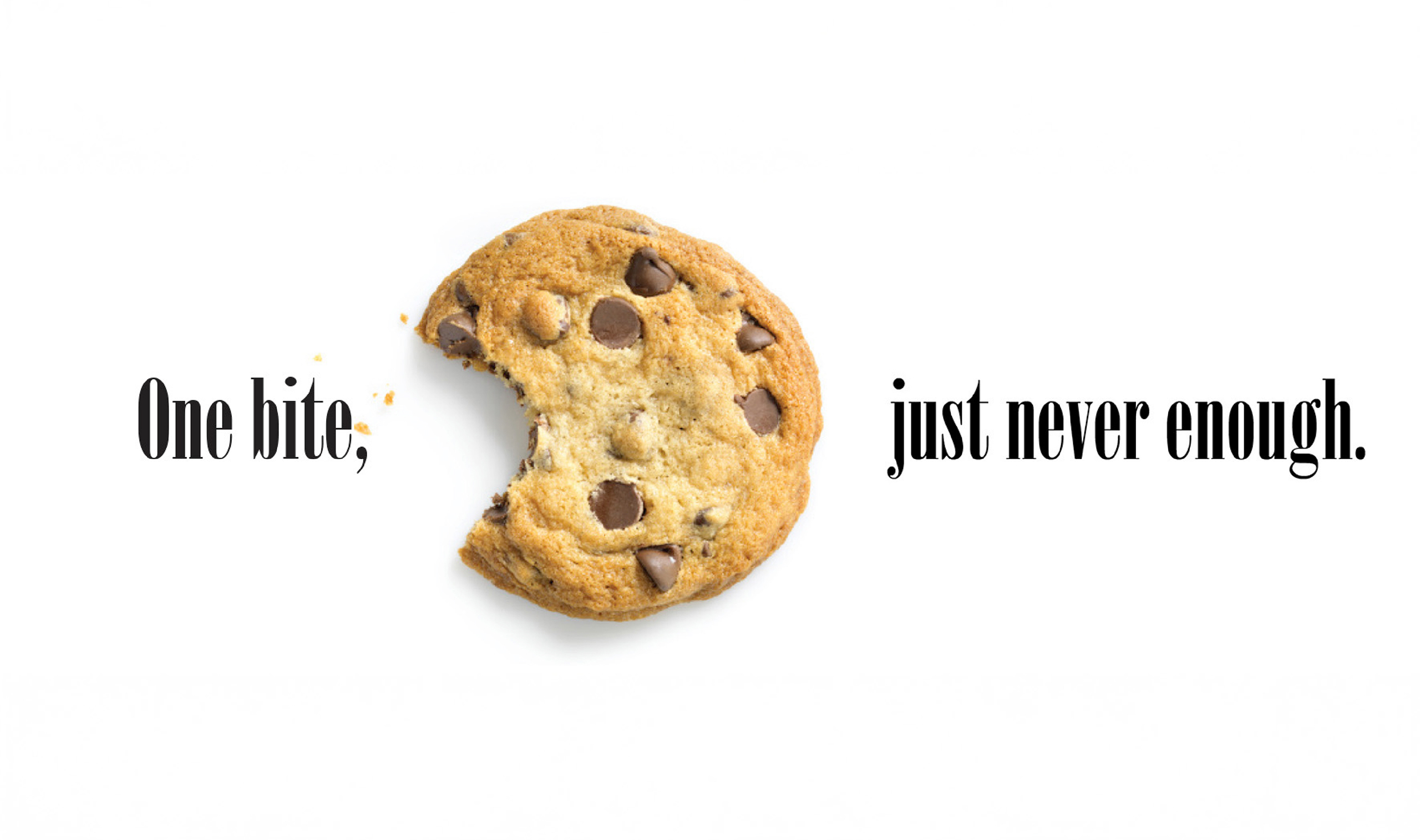
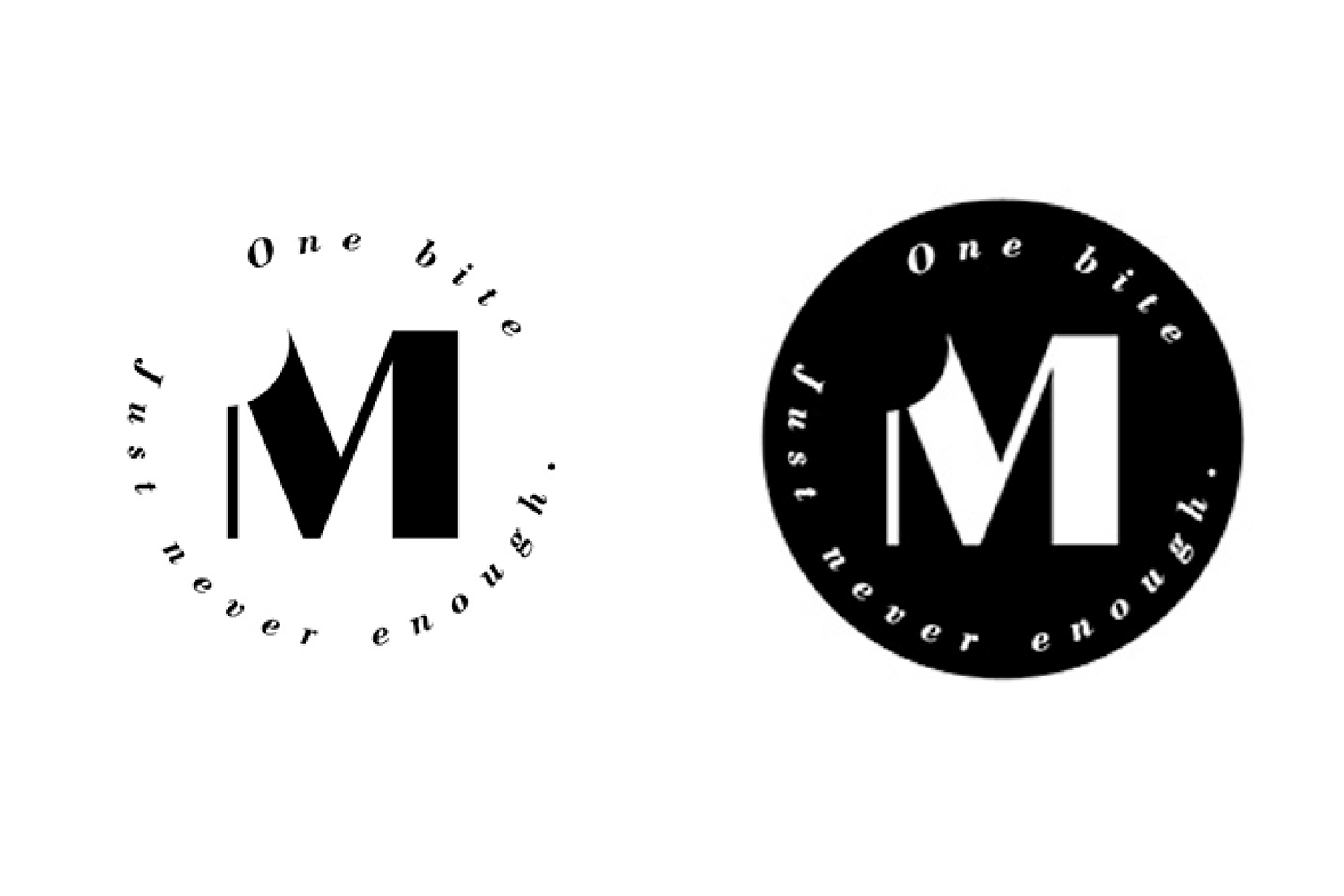
One bite is just never enough
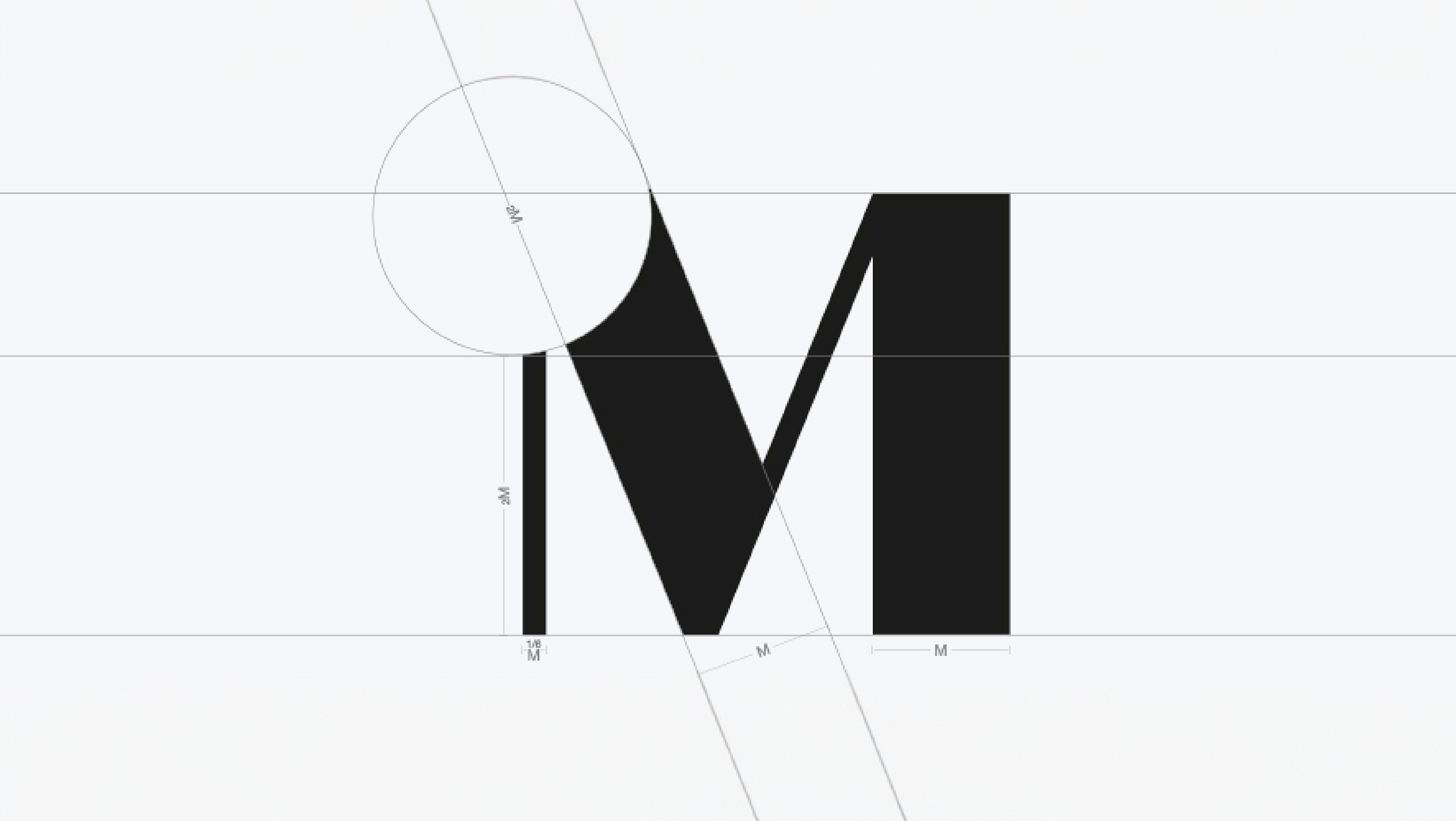
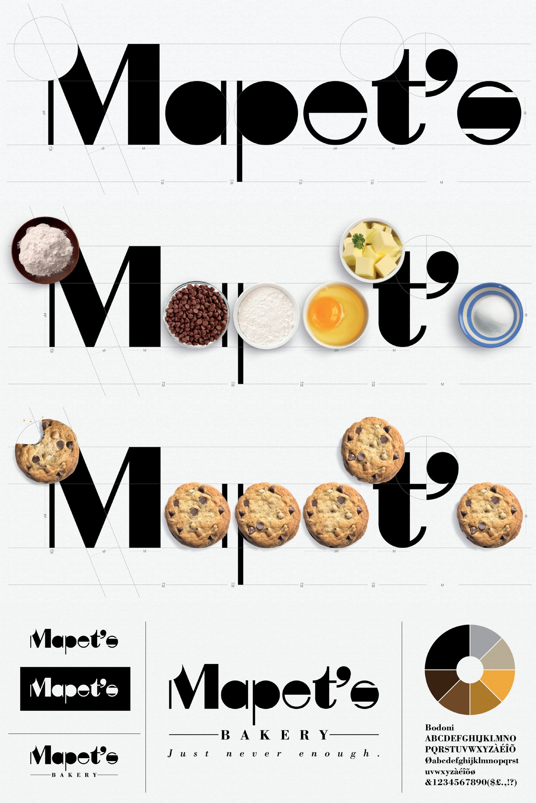
The Mapet’s Bakery logo features a custom font inspired by simple geometric shapes, reflecting a warm, homemade essence. A playful bite mark on the letter “M” symbolises the bakery’s irresistible treats—because one bite is just never enough. The clean yet inviting design balances modern simplicity with a handcrafted touch, capturing the joy of home-baked goodness in every bite.
“Simplicity with a touch of sophistication—where every detail speaks volumes.”
Client
Mapet’s Bakery
Discipline
Branding, Creative Direction
Sector
Food & Drink