B|W System
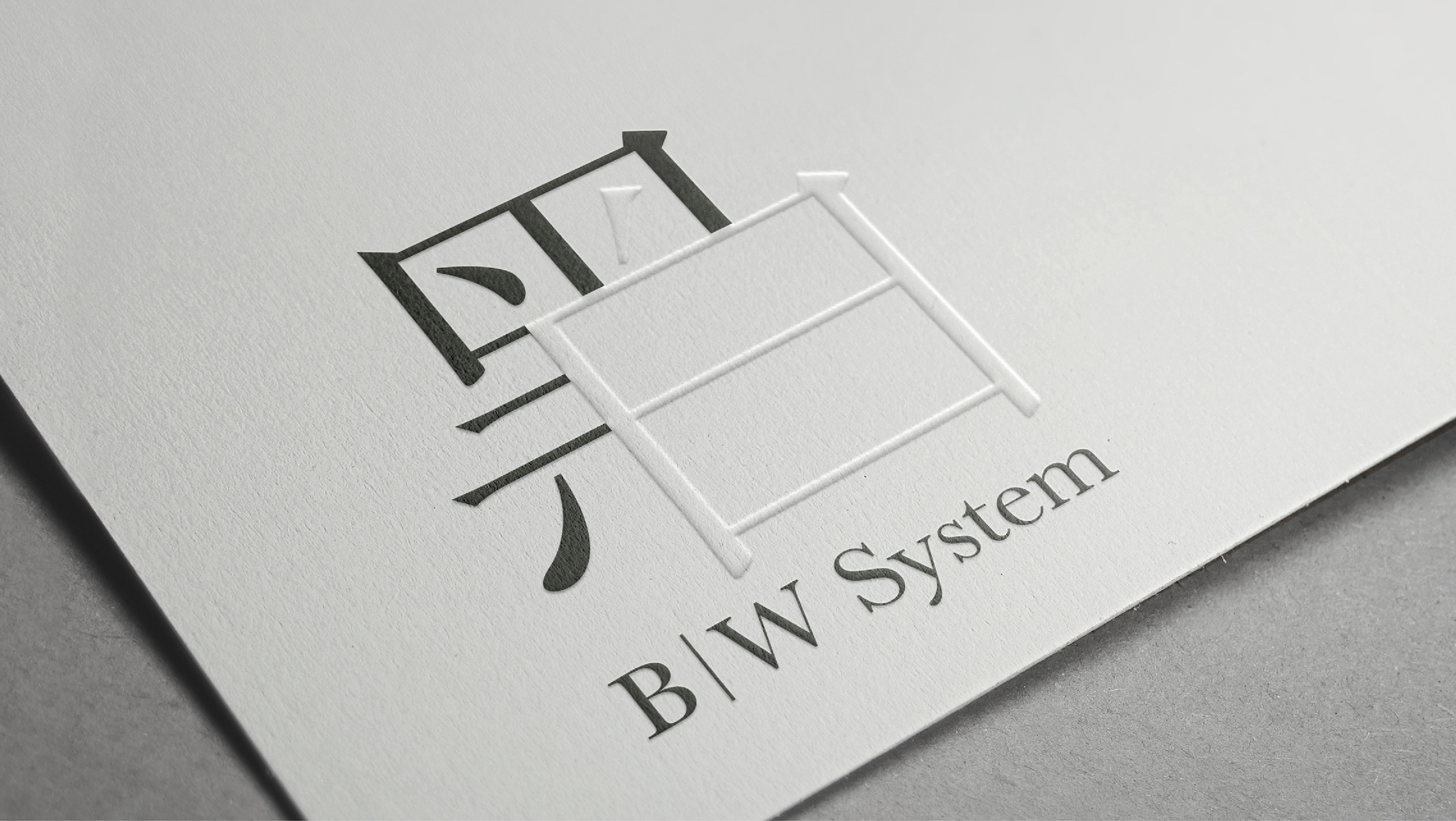
“Brand identity for B|W Shelving System.”

Where Black and White Embrace
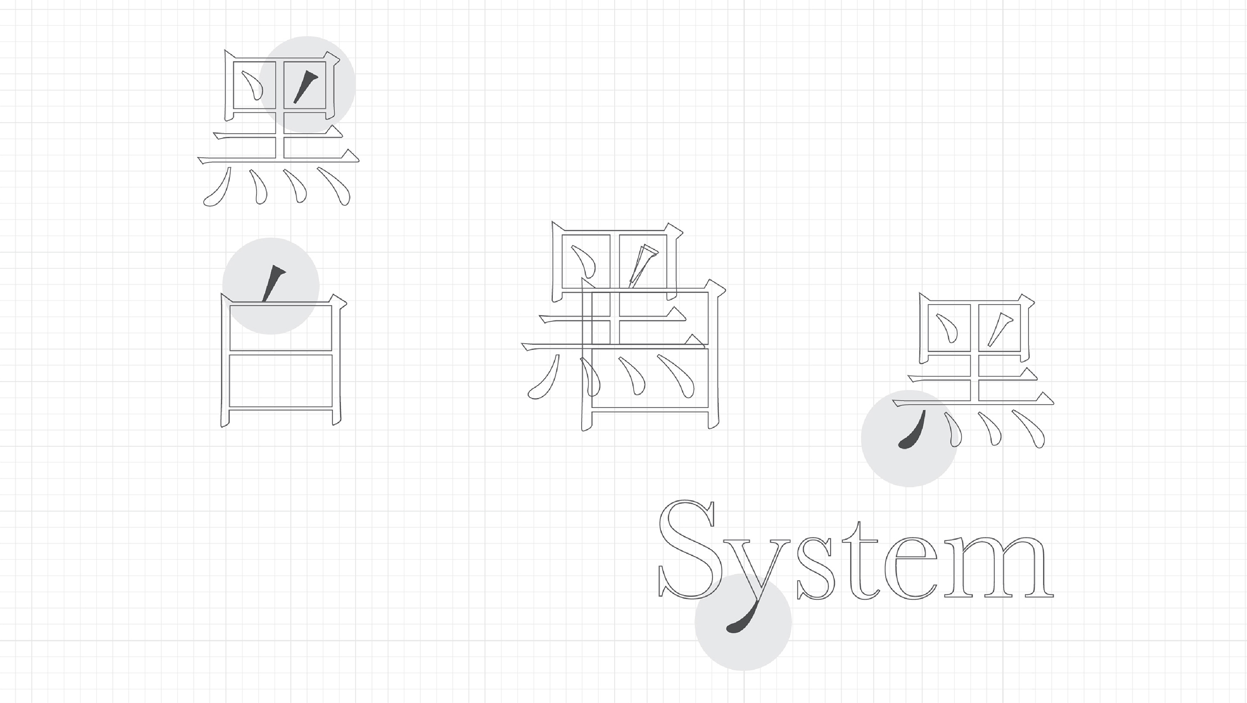
The monogram logo reflects this core idea by integrating the CHI characters 黑 (black) and 白 (white)—a direct representation of “B|W.” These characters are not only symbolic of contrast and balance but also cleverly structured to resemble a B|W shelving setup, reinforcing the system’s modular nature. The interplay of these forms within the monogram visually echoes the way B|W components fit together, embodying both function and aesthetic minimalism.
This logo serves as a seamless extension of the brand’s philosophy—where simplicity, flexibility, and intelligent design come together in a bold yet understated identity.
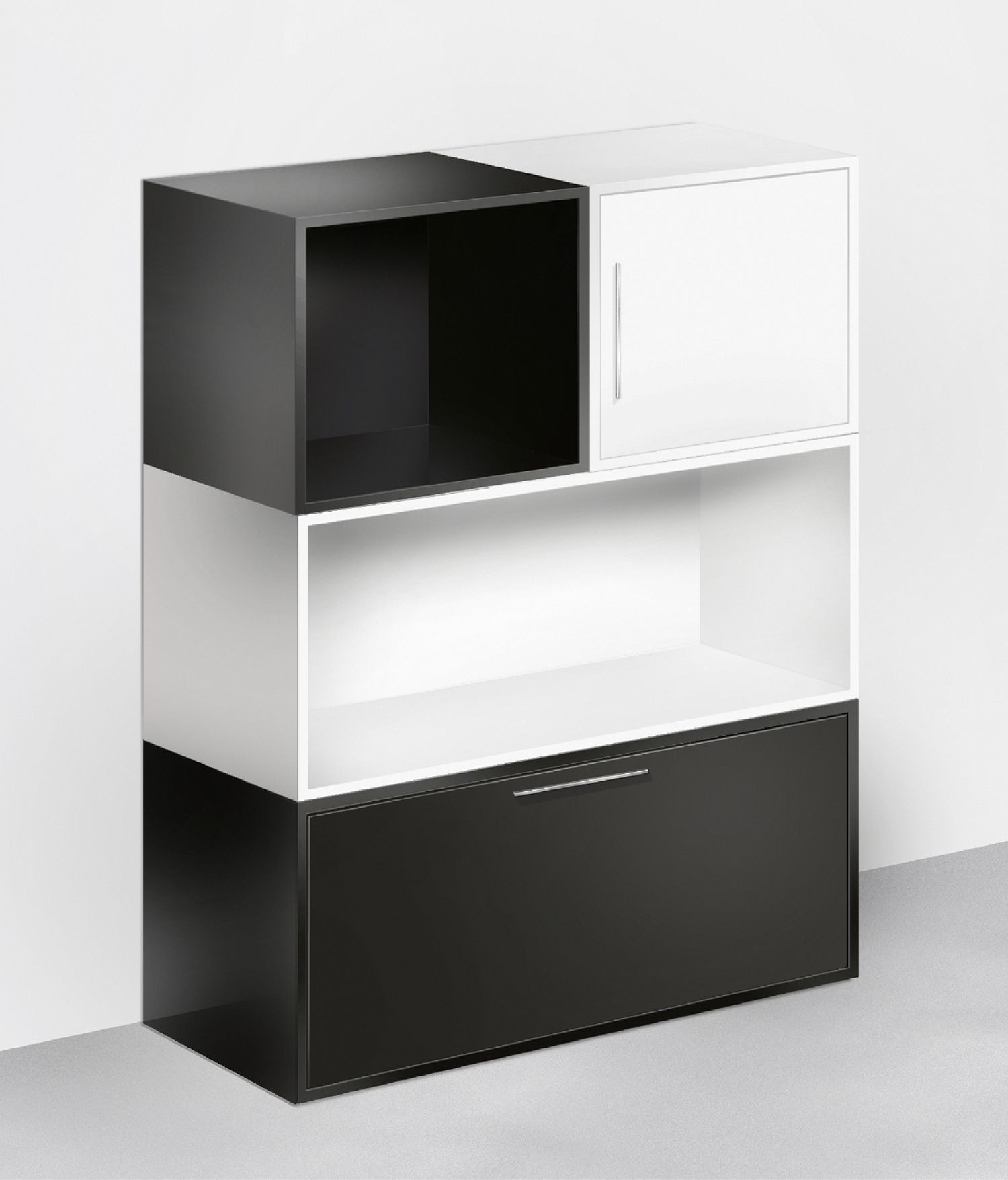
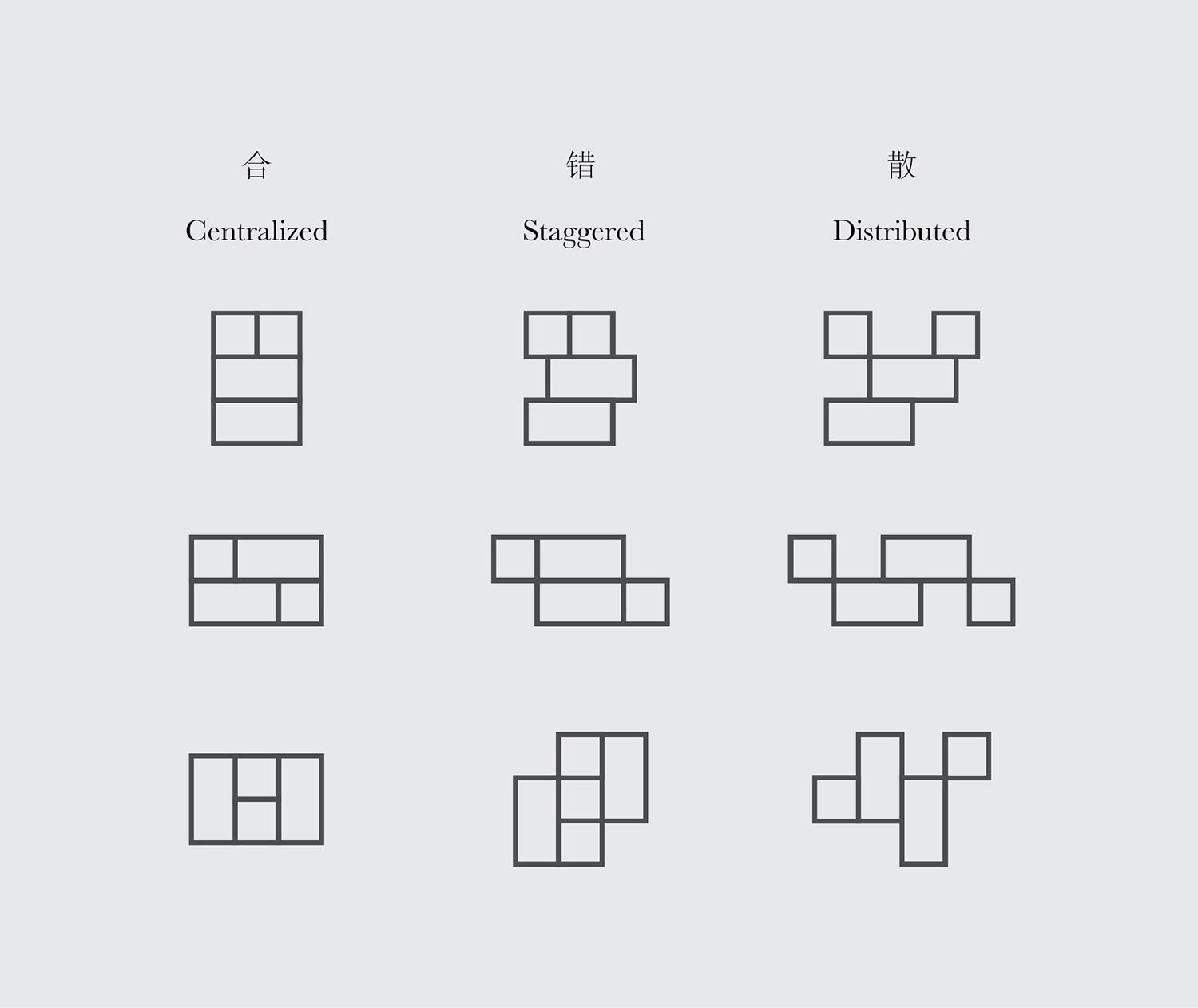
“The B|W Shelving System is built on simplicity. Each unit consists of a few key components that can be arranged in multiple ways.”
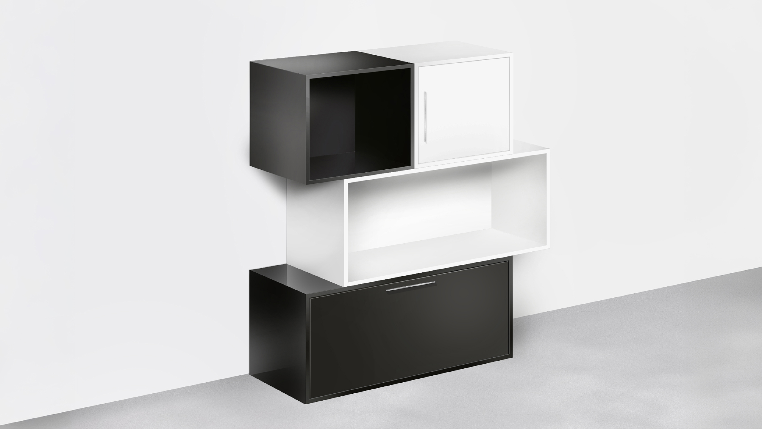
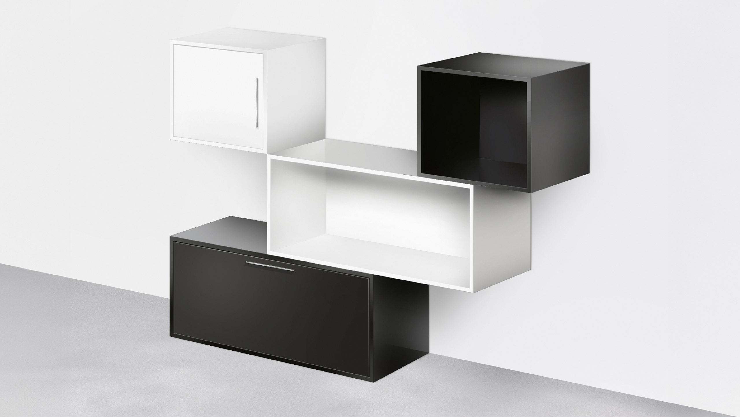
“Its design philosophy revolves around a few essential components that can be arranged in various configurations, allowing for a fully adaptable, tool-free assembly.”
Client
LOFs Furniture
Discipline
Branding, Creative Direction, Product Design
Sector
Design & Architecture