Chop Wah On 100th Anniversary
“Distinctive packaging design representing the culture and heritage of Singapore’s oldest medicated oil and balm manufacturer.”
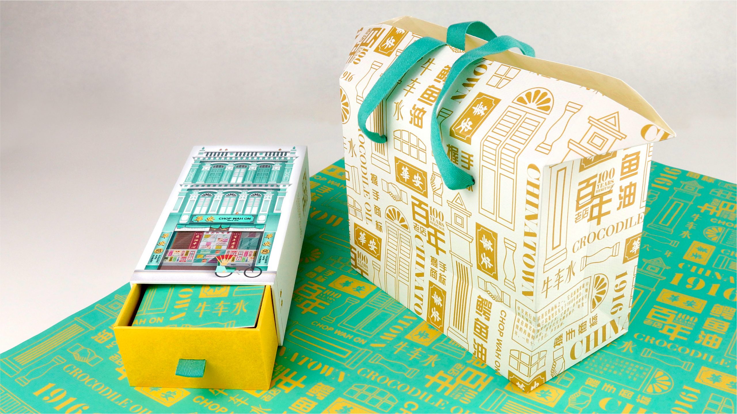
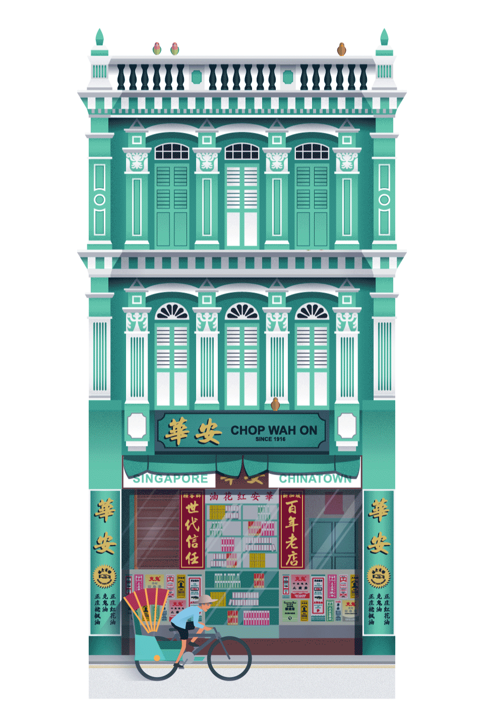
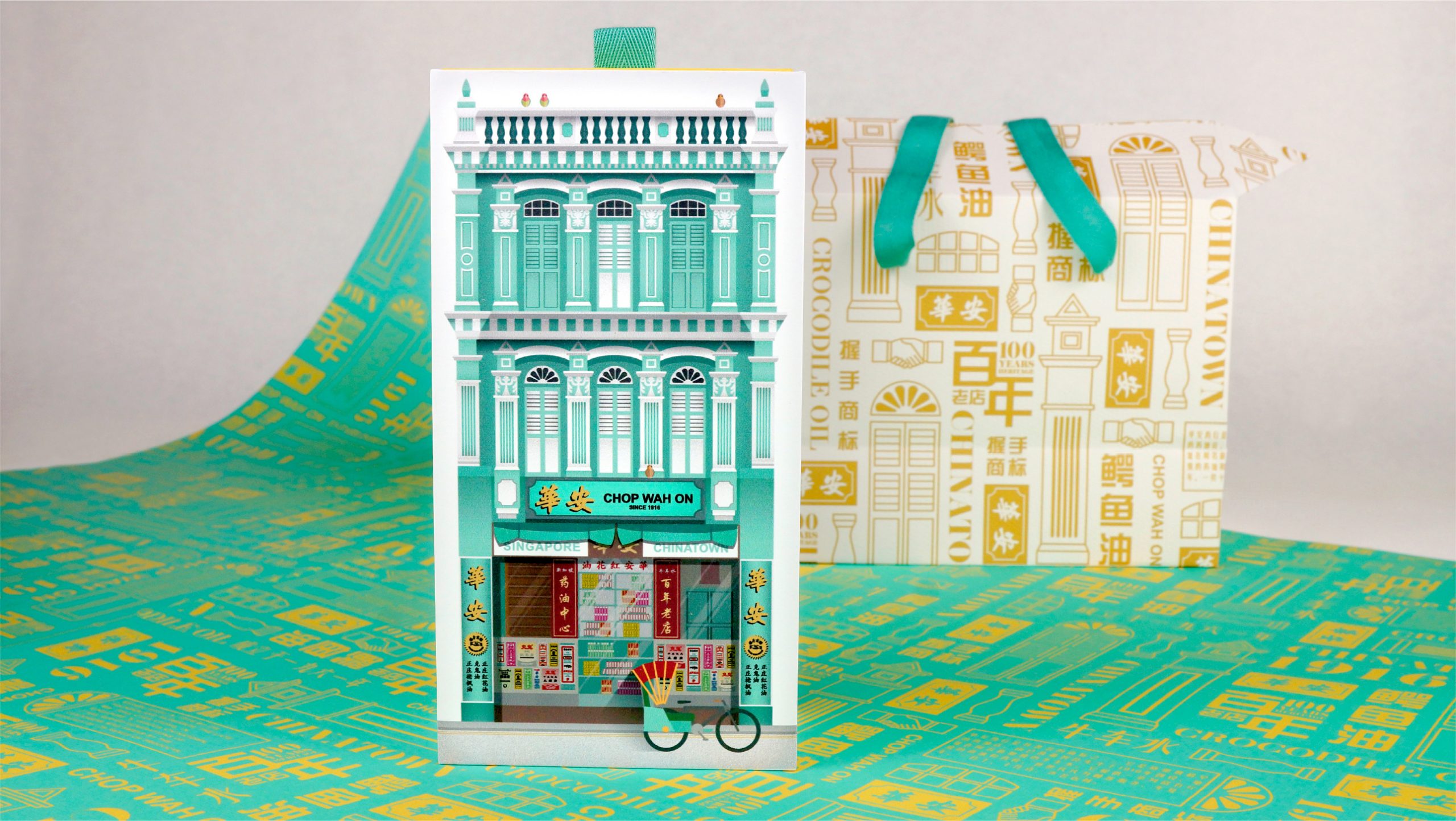
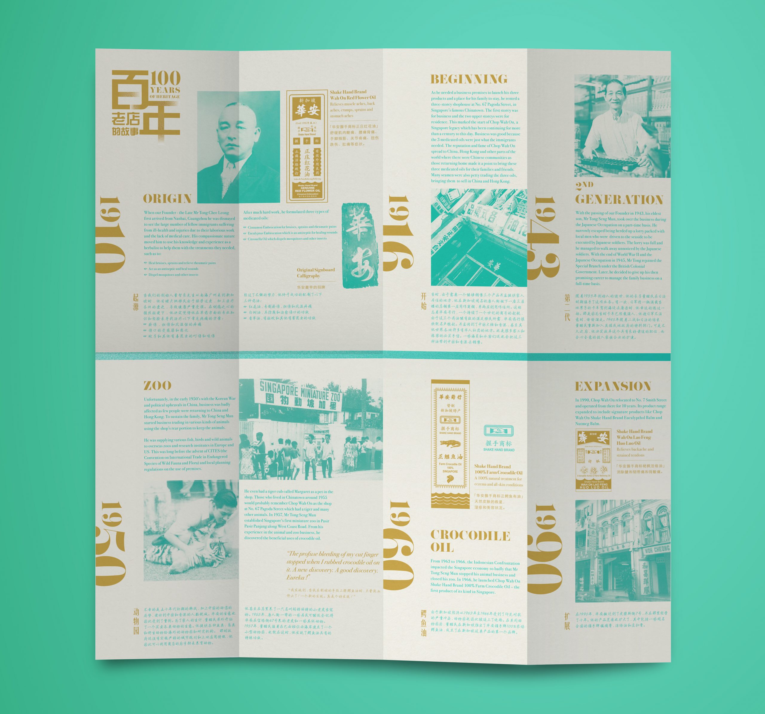
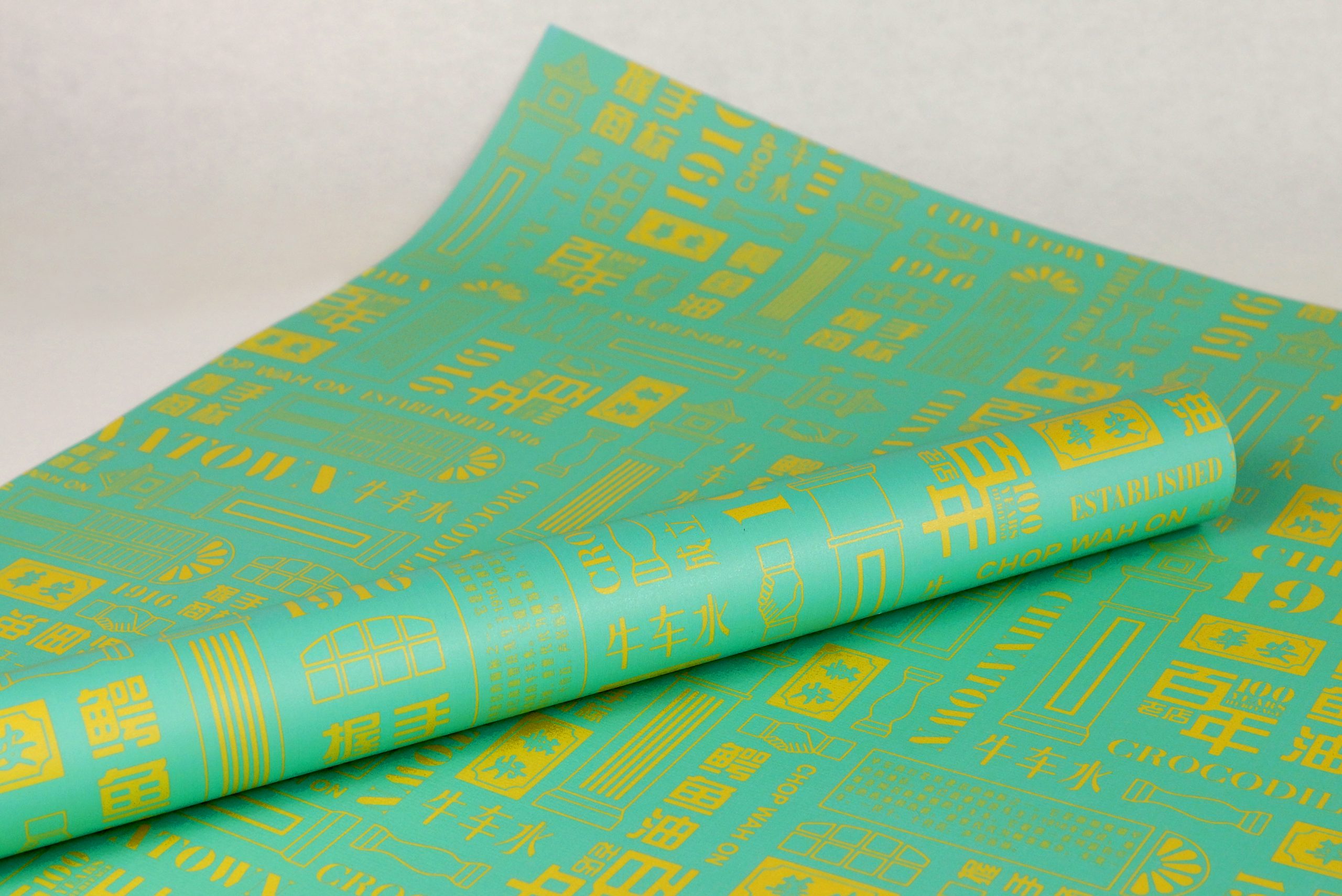
From Architecture to Packaging
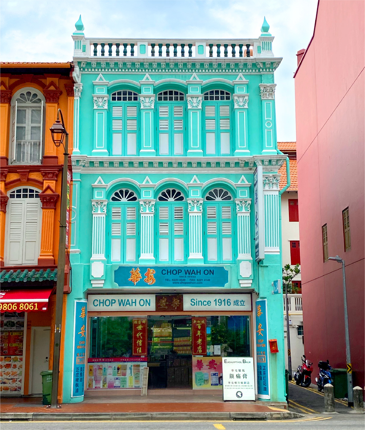
We drew inspiration from Chop Wah On’s striking shopfront which is a heritage shophouse with a turquoise facade and created an illustration based on this historical building.

“The packaging design combines typography, Singapore’s heritage icons, and brand colours. A contemporary graphic styling without losing its cultural values.”

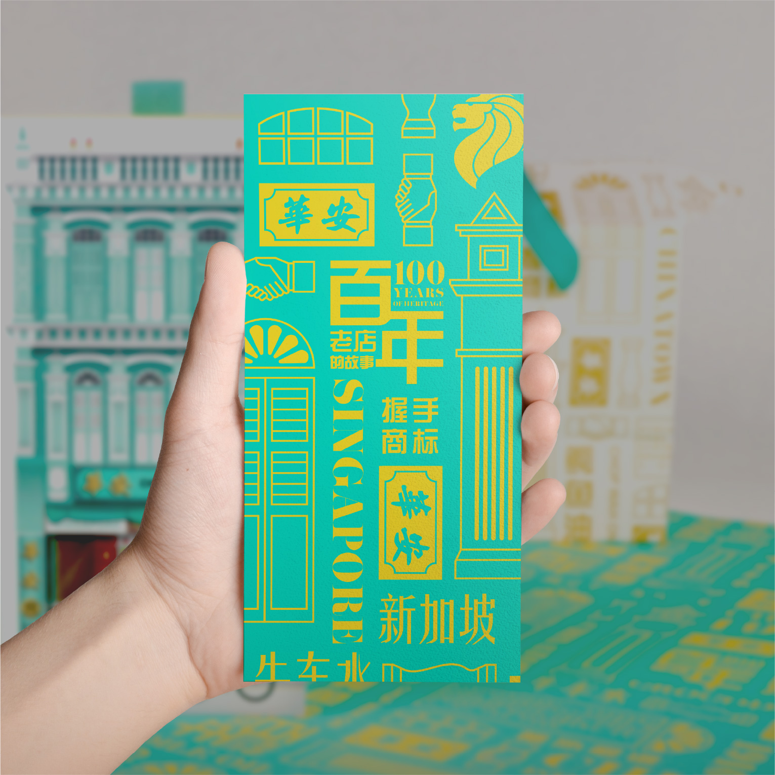
A Memorable Gift
We created a set of graphic motifs that represent Chop Wah On’s history and products. Using a combination of typography and icons, the graphic motif become the first thing that customers see and associate it with Chop Wah On.
Client
Chop Wah On
Discipline
Packaging
Sector
Healthcare